
ECharts
ECharts
http://jsrun.net/t/F4KKp 待这整理,比较不错的Echarts学习网站
http://chartlib.datains.cn/echarts
https://blog.csdn.net/luanpeng825485697/article/details/76739684
属性查找:https://echarts.apache.org/zh/option.html#legend.icon
自定义图例图标:https://blog.csdn.net/rudy_zhou/article/details/111474179

色系
'rgb(76, 167, 163)', 'rgb(45, 204, 110)','rgb(98, 167, 131)','rgb(177, 230, 118)','rgb(15, 206, 255)','rgb(165, 123, 98)','rgb(105, 123, 186)','rgb(238, 238, 0)','rgb(150, 100, 255)','rgb(255, 152, 88)','rgb(54, 122, 194)','rgb(110, 185, 255)'
1 入门案例
- 引入 echarts.js
<script src="echarts.min.js"></script> - 创建dom 容器
<div id="main" style="width: 600px;height:400px;"></div> - 初始化echarts实例
标注了:x y x2 y2的距离

<!DOCTYPE html>
<html>
    <head>
        <meta charset="utf-8">
        <title>ECharts</title>
        <!-- 引入 echarts.js -->
        <script src="echarts.min.js"></script>
    </head>
    <body>
        <!-- 为ECharts准备一个具备大小(宽高)的Dom
            当前div容器,必须放到 js 前面,否在初始化找不到元素。(高度不能用百分比=========待定)
        -->
        <div id="main" style="width: 600px;height:400px;"></div>
        <script type="text/javascript">
        // 基于准备好的dom,初始化echarts实例
        var myChart = echarts.init(document.getElementById('main'));
        // 指定图表的配置项和数据
        var option = {
            title: {
                text: 'ECharts 入门示例'
            },
            tooltip: {},
            grid: {
                //"left":"auto",
                "containLabel": true,
                //显示坐标轴上的时间轴和刻度尺
                y2: 0,
                x2: 10,
                x: 7
            },
            legend: {
                data: ['销量']
            },
            xAxis: {
                data: ["衬衫", "羊毛衫", "雪纺衫", "裤子", "高跟鞋", "袜子"],
                label: {
                    normal: {
                        show: true //用来在柱形图中显示数值  在柱状图里面
                    }
                },
                itemStyle: { //=======用来在柱形图中显示数值  在柱状图上方
                    normal: {
                        color: '#8470FF',
                        //========设置图片颜色
                        label: {
                            show: true,
                            position: 'top',
                            textStyle: {
                                fontSize: 12
                            }
                        }
                    }
                },
                axisLabel: { //x轴文字显示,针对文字过长会间隔出现,这里可以强制全部出现,并可以设置文字倾斜度
                    interval: 0,
                    //0:全部显示,1:间隔为1显示对应类目,2:依次类推,(简单试一下就明白了,这样说是不是有点抽象)
                    rotate: -30,  //倾斜显示,-:顺时针旋转,+或不写:逆时针旋转
                    show: true,
                    // x轴文字属性
                    textStyle: {
                        color: '#fff'
                    }
                }
            },
            yAxis: {
                axisLabel: {
                    formatter: '{value}',
                    textStyle: {
                        color: '#fff',
                        fontSize: 16,
                    },
                }
            },
            series: [{
                name: '销量',
                type: 'bar',
                data: [5, 20, 36, 10, 10, 20],
                //后期可以用ajax从后台获取数据,,
                /*axisLabel:{			//x轴文字倾斜
                    interval:0,
                    rotate:45,
                    margin:2,
                    textStyle:{
                        color:"#222"
                    }}, */
            }]
        };
        // 使用刚指定的配置项和数据显示图表。
        myChart.setOption(option);
            //定义单击事件
        pieChart.on("click", function (param){
            If(param.name=’销量’){
            top.$.jBox('iframe:${ctx}/video/videoAnalyseResult/list?eqClazzs='+eqType+'&nums=0',{title: '状态数据 ',width: window.innerWidth-360,height:window.innerHeight, top:20, buttons: { '关闭': true }});	//以弹窗的心事展示页面
            }
        }
        </script>
    </body>
</html>
说明:
x,y 文字属性:
axisLabel: { //x轴文字显示,针对文字过长会间隔出现,这里可以强制全部出现,并可以设置文字倾斜度
	interval: 0,
	show: true,  // 是否显示
	inside: false, // 是否朝内
	margin: 8, // 刻度标签与轴线之间的距离
	color: 'red',  // 默认取轴线的颜色
	textStyle: {
		color: '#fff'
	},
},
axisLine: {       // 坐标轴 轴线
	show: true,  // 是否显示
	// ------   线 ---------
	lineStyle: {
		color: '#8470FF',
		width: 2,
		type: 'solid'
	}
},
axisTick: {    // 坐标轴 刻度
      show: true,  // 是否显示
      inside: true,  // 是否朝内
      length: 3,     // 长度
      lineStyle: {   // 默认取轴线的样式
        color: 'red',
        width: 1,
        type: 'solid'
      }
},
图例
                legend: {
                    data: ['设备总数'],
                    right:"5%",
                    top:'10px',
                    textStyle:{//----图例内容样式
                        color:'#fff',//---所有图例的字体颜色
                        //backgroundColor:'black',	//---所有图例的字体背景色
                    },
                    icon:'circle',			//----图例的外框样式
                    textStyle:{
                        color:'#fff',		//----单独设置某一个图例的颜色
                        //backgroundColor:'black',//---单独设置某一个图例的字体背景色
                    }
                },
刻度-添加线属性,就会出现刻度,如果不想显示,手动剔除
axisTick: {    // 坐标轴 刻度
	show: false,  // 是否显示
},
echart 设置柱子之间的间距
    series :
            {
               name:'',
               type:'bar',
               barWidth:20,
               barGap:'80%',/*多个并排柱子设置柱子之间的间距*/
               barCategoryGap:'50%',/*多个并排柱子设置柱子之间的间距*/
               data:[],
               itemStyle: {
                   normal: {
                	   barBorderRadius: false,
                       color: '#1E9FFF',
                   }
               }
           }
图例 设置多个,分别不同颜色,和样式
legend: {
                right:"5%",
                top:'10px',
                data:[//----图例内容
                    {
                        name:'Rainfall',
                        icon:'circle',			//----图例的外框样式
                        textStyle:{
                            color:'#fff',		//----单独设置某一个图例的颜色
                            //backgroundColor:'black',//---单独设置某一个图例的字体背景色
                        }
                    },
                    {
                        name:'Evaporation',
                        icon:'circle',			//----图例的外框样式
                        textStyle:{
                            color:'#fff',		//----单独设置某一个图例的颜色
                            //backgroundColor:'black',//---单独设置某一个图例的字体背景色
                        }
                    }
                ],
            },
加标记 itemStyle---normal --- label
series: [
    {
        name: '派单闭环率',
        type: 'line',
        yAxisIndex: 1,
        data: dataMap['clpd_warn_pic_rate'],
        itemStyle: {
            normal: {
                color: '#01a948',
                /*信息显示方式*/
                label: {
                    show: true,
                    position: 'top',
                    formatter: '{c} %'
                }
            }

        },
    }
]
2.常用属性说明
2.1 折线面积图 (折线平滑)
var option={
    title:{
        text:'测试'
    },
    tooltip:{},
    legend:{
        data:['test']
    },
    xAxis:{
        type:'category',        //坐标轴类型:类目轴
        boundaryGap:false,      //1.基础面积图  :类目轴中:留白区域,与左边坐标轴和右边图的边缘之间是否有留白。默认true
        data:data.data
    },
    yAxis:{
        type:'value'        //坐标轴类型:数值轴
    },
    series:[{
        name:'test',
        type:'line',
        data:data.zhi,
        smooth:true,        //平滑曲线图。值可为数字=================================================AAAAA
        areaStyle:{         //2.基础面积图。区域填充样式
            color:'#ccc'    //支持RGB、ALPHA通道+RGBA、十六进制、渐变色、纹理填充
        }
    }]
};
2.2 内容铺满父容器
grid属性
grid: {
    left: '2%',
    right: '2%',
    bottom: '3%',
    containLabel: true
},
2.3 设置气泡
data中也可以单独设置颜色
data: [
    {
        value: [118.8062, 31.9208],
        itemStyle: { color: '#4ab2e5' }
    },
    {
        value: [127.9688, 45.368],
        itemStyle: { color: '#4fb6d2' }
    }
]
series: [
    // 数据系列
    {
        // 发散 effectScatter  分散点scatter
        type: 'effectScatter',
        // series坐标系类型
        coordinateSystem: 'geo',
        // 设置图形 'circle', 'rect', 'roundRect', 'triangle', 'diamond', 'pin', 'arrow'
        symbol: 'circle',
        // //标记的大小,可以设置成诸如 10 这样单一的数字,也可以用数组分开表示宽和高,例如 [20, 10] 表示标记宽为20,高为10
        symbolSize: [20, 20],
        symbolOffset: [20, 20], // 设置 气泡 偏移
        showEffectOn: 'render', // 配置何时显示特效。可选:'render' 绘制完成后显示特效。'emphasis' 高亮(hover)的时候显示特效。
        rippleEffect: {
            // 涟漪特效相关配置。
            brushType: 'stroke' // 波纹的绘制方式,可选 'stroke' 和 'fill'
        },
        hoverAnimation: true, // 是否开启鼠标 hover 的提示动画效果。
        zlevel: 1, // 所属图形的 zlevel 值
        // 气泡字体设置
        label: {
            normal: {
                show: true, // 是否显示
                textStyle: {
                    color: '#fff', // 字体颜色
                    fontSize: 8 // 字体大小
                },
                // 返回气泡数据
                // formatter: function (e, t, n) {
                //   const data = e.data
                //   const context = `
                //           <div>
                //               <p><b style="font-size:15px;">${data.name}</b>(2020年第一季度)</p>
                //               <p class="tooltip_style"><span class="tooltip_left">成果总数</span><span class="tooltip_right">${data.value}</span></p>
                //           </div>
                //           `
                //   return context
                // },
                formatter (value) {
                    return value.data.value[2]
                }
            }
        },
        itemStyle: {
            normal: {
                color: '#1E90FF' // 标志颜色
            }
        },
        geoIndex: 0,
        // 给区域赋值
        data: []// this.convertData(this.data),
    }
]
2.4 echarts地图中散点图的symbol使用自定义图片
series: [
  {
    type: 'scatter',
    geoIndex: 0,
    coordinateSystem: 'geo',
    hoverAnimation: false,
    symbolSize: 78,
    symbol: 'image://' + require('@/assets/border.png'),  // require引入图片路径
    label: {
      show: true,
      color: '#00e5ff',
      offset: [0, 0],
      fontSize: 26
    },
    data: [
      {
        name: '阳泉',
        value: [113.57, 37.85]
      },
      {
        name: '湖州',
        value: [120.1, 30.86]
      }
    ],
    zlevel: 3
  }
]
2.5 Echarts 加载动画
https://blog.csdn.net/weixin_45677987/article/details/119581692
1: 加载动画

   Echarts 已经内置好了加载数据的动画,  我们只需要在合适的时机显示或者隐藏即可。

2: 显示加载动画
   mCharts.showLoading();   // 显示加载动画

3: 隐藏加载动画
   mCharts.hideLoading();   // 隐藏加载动画

   var mCharts = echarts.init(document.querySelect("div"));
      mCharts.showLoading();   // 在获取数据之前, 显示加载动画
   $.get('data/test_data.json', function(ret) {
      mCharts.hideLoading();   // 在服务器获取数据成功之后, 隐藏加载动画
   })

4: 显示动画的实现方法:
   改变数据,  使用setOption()  方式改变数据:

5: 增量动画的实现:
   增量动画的实现方式:
   mCharts.setOption
   所有的数据的更新 都是通过setOption 实现;
   不用考虑数据到底产生那些变化
   Echarts 会找到两组数据之间的差异然后通过合适的动画去表现数据的变化。

6: setOption:  可以设置多次
   新的option 和 旧的 option
   新旧的option 的关系不是相互覆盖的关系,  是相互整合的关系。
   我们在设置option 的时候,  只需要考虑到变化的部分就可以了。
动画的配置
1: 开启动画项
  animation: true;   // 是否控制动画开启

2: 动画时长: animationDuration: 5000
   动画的时长,  它是以毫秒为单位

3: 缓动动画
   animationEasing: 'liner'  // 匀速的    'boundceOut':  带有反弹效果

4: 动画阈值:

  animationThreshold: 8;   // 没有动画效果
2.6 实现动画效果


 series: [
                    // 数据系列
                    {
                        tooltip: {
                            show: false
                        },
                        type: 'effectScatter',
                        coordinateSystem: 'geo',
                        rippleEffect: {
                            scale: 10,
                            brushType: 'stroke'
                        },
                        showEffectOn: 'render',
                        itemStyle: {
                            normal: {
                                color: '#00FFFF'
                            }
                        },
                        label: {
                            normal: {
                                color: '#fff'
                            }
                        },
                        symbol: 'circle',
                        symbolSize: [10, 5],
                        symbolOffset: [10, 5], // 设置 气泡 偏移
                        data: [],
                        zlevel: 1
                    },
                    {
                        type: 'scatter',
                        coordinateSystem: 'geo',
                        itemStyle: {
                            color: '#00FFF6'
                        },
                        symbol: 'image://' + require('@/assets/imgs/map/001.png'),
                        symbolSize: [32, 41],

                        symbolOffset: [0, -20],
                        z: 999,
                        data: []
                    },
                    {
                        type: 'scatter',
                        coordinateSystem: 'geo',
                        label: {
                            normal: {
                                show: true,
                                formatter: function(params) {
                                    var name = params.name
                                    var value = params.value[2]
                                    var text = `{fline|${value}人}\n{tline|${name}}`
                                    return text;
                                },
                                color: '#fff',
                                rich: {
                                    fline: {
                                        padding: [0, 25],
                                        color: '#fff',
                                        fontSize: 14,
                                        fontWeight: 400
                                    },
                                    tline: {
                                        padding: [0, 27],
                                        color: '#ABF8FF',
                                        fontSize: 12
                                    }
                                }
                            },
                            emphasis: {
                                show: true
                            }
                        },
                        itemStyle: {
                            color: '#00FFF6'

                        },
                        symbol: 'image://' + require('@/assets/imgs/map/002.png'),
                        symbolSize: [100, 50],
                        symbolOffset: [0, -60],
                        z: 999,
                        data: []
                    }
                ]
3.7 label
label: {
    normal: {
        color: '#f34e2b', // '#1DE9B6',
            show: true,
                // formatter: '{c}',
                formatter (value) {
                return value.data.value[2]
            }
    }
},
tooltip 属性中 支持自定义html,但是 series 中的label 是不行的,可以通过 rich
    // 提示浮窗样式
    tooltip: {
        show: true,
        trigger: 'item',
        alwaysShowContent: false,
        backgroundColor: '#0C121C',
        borderColor: 'rgba(0, 0, 0, 0.16);',
        hideDelay: 100,
        triggerOn: 'mousemove',
        enterable: true,
        textStyle: {
            color: '#DADADA',
            fontSize: '20',
            width: 35,
            height: 45,
            overflow: 'break'
        },
        formatter: function (e, t, n) {
            const data = e.data
            const context = `
                              <div>
                                  <p><b>${data.name}</b>(总数)</p>
                                  <p class="tooltip_style"><span class="tooltip_left">工程总数</span><span class="tooltip_right">${data.value[2]}</span></p>
                              </div>
                              `
            return context
        },
        showDelay: 100
    },

文字居中 :align: 'center' 同时需要注意的是
{
                    type: 'scatter',
                    coordinateSystem: 'geo',
                    label: {
                        normal: {
                            show: true,
                            formatter: function (params) {
                                var name = params.name;
                                var value = params.data.datas;
                                var text = `{fline|${value}}\n{tline|${name}}`;
                                return text;
                            },
                            color: '#fff',
                            rich: {
                                fline: {
                                    padding: [0, 25],
                                    align: 'center',
                                    color: '#fff',
                                    textShadowColor: '#030615',
                                    textShadowBlur: '0',
                                    textShadowOffsetX: 1,
                                    textShadowOffsetY: 1,
                                    fontSize: 14,
                                    fontWeight: 400,
                                },
                                tline: {
                                    padding: [0, 27],
                                    color: '#ABF8FF',
                                    fontSize: 12,
                                },
                            },
                        },
                        emphasis: {
                            show: true,
                        },
                    },
                    itemStyle: {
                        color: '#00FFF6',
                    },
                    symbol: img2,
                    symbolSize: [100, 50],
                    symbolOffset: [0, -60],
                    z: 999,
                    data: mapDate,
                }
label 设置字体和图表保持一致

                label: {
                    show: true,
                    normal: {
                        show: true,
                        position: 'outside',
                        textStyle: {
                            align: 'left'
                        },
                        // formatter: '{a|{b}} \n {b|{d}% }\n {hr|}',
                        formatter: '{a|{b}} \n {b|{d}% }',
                        padding: [20, 0, 0, 0],
                        rich: {
                            icon: {
                                fontSize: 12
                            },
                            a: {
                                fontSize: 14,
                                padding: [0, 0, 5, 0],
                                color: '#fff',
                                fontWeight: 'bold',
                            },
                            b: {
                                fontSize: 14,
                                fontWeight: 'bold',
                                // color: '#fff'
                                color: 'inherit' // 可以保证字体颜色 复用 图表中的颜色
                            }
                        },
                    },
                },
3.8 扩散圆点-effectScatter(带有涟漪特效动画的散点(气泡)图)

引入utils组件
export default {
  fontSize: function(res) {
    let clientWidth = window.innerWidth||document.documentElement.clientWidth||document.body.clientWidth;
    if (!clientWidth) return;
    let fontSize = 100 * (clientWidth / 1920);
    return res*fontSize;
  }
          // 扩散圆点-effectScatter(带有涟漪特效动画的散点(气泡)图)
          {
            type: 'effectScatter',
            zlevel: 3, // 层级
            coordinateSystem: 'geo', // 该系列使用的坐标系,cartesian2d(使用二维的直角坐标系),polar(使用极坐标系)
            rippleEffect: { // 涟漪特效相关配置
              scale: utils.fontSize(0.1), // 动画中波纹的最大缩放比例
              brushType: 'stroke', // 波纹的绘制方式
            },
            showEffectOn: 'render', // 配置何时显示特效,render(绘制完成后显示特效),emphasis(高亮(hover)的时候显示特效)
            itemStyle: {
              normal: {
                color: '#00FFFF', // 颜色
              }
            },
            symbol: 'circle', // 标记的图形
            symbolSize: [utils.fontSize(0.1), utils.fontSize(0.04)], // 标记的大小
            data: [ // 系列中的数据内容数组
              {
                "name": "铜川市",
                "value": [108.979608, 35.25]
              }
            ],
          },
3.9 监听
- 监听点击空白区域
 this.myChart.getZr().on('click', params => {
                    if (!params.target) {
                        // 鼠标点击地图外 还原地图大小
                        console.log('click')
                    }
                })
- 浏览器尺寸变化,重构地图
window.addEventListener('resize', () => {
                    this.myChart.resize()
                })
- 地图监听缩放
            listenerZoom () {
                this.myChart.on('georoam', params => { // 这里是bmaproam方法,其余都一样
                    var options = this.myChart.getOption() // 获得option对象
                    // 捕捉到缩放时
                    if (options && options.geo[0].zoom && options.geo[0].zoom != null) {
                        options.geo[1].zoom = options.geo[0].zoom // 下层geo的缩放等级跟着上层的geo一起改变
                    }
                    // 捕捉到拖曳时
                    if (options && options.geo[0].center && options.geo[0].center != null) {
                        options.geo[1].center = options.geo[0].center // 下层的geo的中心位置随着上层geo一起改变
                    }
                    this.myChart.setOption(options) // 设置option
                })
            },
3.10 tooltip 异步加载弹窗信息
import axios from 'axios'

const toHTML = (res) => {
  console.log(res.data.errorMessage, 123456)
  return res.data.errorMessage
}

tooltip: {
  trigger: 'axis',
  confine: true, // 将 tooltip 框限制在图表的区域内 防止超出div被遮盖
  triggerOn: 'click', // 点击时触发 以免频繁的调用接口
  formatter: function (params, ticket, callback) {
    axios.get('/api/后台接口', {
      params: {
        // 接口参数
      }
    }).then(res => {
      if (res.data.errorCode === 0) {
        // res.data.errorCode === 0返回正常,调用回调函数
        callback(ticket, toHTML(res))
      }
    }).catch(res => {
      console.log(res, 'get请求出错!')
    })
    return 'Loading'
  }
},
3.11 tooltip 属性
某些场景下,弹窗会跑出容器范围,导致显示不全 通过
confine: true, //是否将 tooltip 框限制在图表的区域内
tooltip ={                                 //提示框组件
    trigger: 'item',                       //触发类型,'item'数据项图形触发,主要在散点图,饼图等无类目轴的图表中使用。 'axis'坐标轴触发,主要在柱状图,折线图等会使用类目轴的图表中使用。
    triggerOn:"mousemove",                 //提示框触发的条件,'mousemove'鼠标移动时触发。'click'鼠标点击时触发。'mousemove|click'同时鼠标移动和点击时触发。'none'不在 'mousemove' 或 'click' 时触发
    showContent:true,                      //是否显示提示框浮层
    alwaysShowContent:true,                //是否永远显示提示框内容
    showDelay:0,                           //浮层显示的延迟,单位为 ms
    hideDelay:100,                         //浮层隐藏的延迟,单位为 ms
    enterable:false,                       //鼠标是否可进入提示框浮层中
    confine:false,                         //是否将 tooltip 框限制在图表的区域内
    transitionDuration:0.4,                //提示框浮层的移动动画过渡时间,单位是 s,设置为 0 的时候会紧跟着鼠标移动
    position:['50%', '50%'],               //提示框浮层的位置,默认不设置时位置会跟随鼠标的位置,[10, 10],回掉函数,inside鼠标所在图形的内部中心位置,top、left、bottom、right鼠标所在图形上侧,左侧,下侧,右侧,
    formatter:"{b0}: {c0}<br />{b1}: {c1}",//提示框浮层内容格式器,支持字符串模板和回调函数两种形式,模板变量有 {a}, {b},{c},{d},{e},分别表示系列名,数据名,数据值等
    backgroundColor:"transparent",         //背景色
    borderColor:"#ccc",                    //边框颜色
    borderWidth:0,                         //边框线宽
    padding:5,                             //图例内边距,单位px  5  [5, 10]  [5,10,5,10]
    textStyle:mytextStyle,                 //文本样式
    confine: true,    //是否将 tooltip 框限制在图表的区域内(解决遮挡问题)
    appendToBody: true, // 将弹窗追加到body节点下(解决遮挡问题)
};
提示框tooltip被遮挡

解决办法:
一、tooltip. confine
tooltip: {
   confine: true    //是否将 tooltip 框限制在图表的区域内。
},
二、tooltip. appendToBody
tooltip: {
   appendToBody: true
},
3.20 echarts x轴标签文字过多导致显示不全&文本显示
参考: https://blog.csdn.net/superlover_/article/details/79714823
formatter: (value) => {
   return xxxx
},
方式一:倾斜 xAxis.axisLabel 属性
axisLabel: {
   interval:0,
   rotate:40
}
interval
坐标轴刻度标签的显示间隔(在类目轴中有效哦),默认会采用标签不重叠的方式显示标签(也就是默认会将部分文字显示不全) 可以设置为0强制显示所有标签,如果设置为1,表示隔一个标签显示一个标签,如果为3,表示隔3个标签显示一个标签,以此类推
rotate
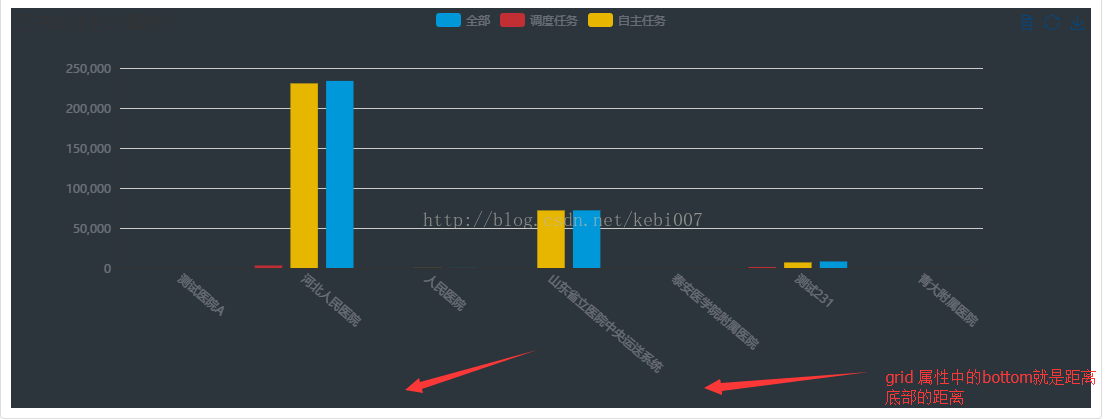
标签倾斜的角度,在类目轴的类目标签显示不全时可以通过旋转防止标签重叠(官方这样说的)旋转的角度是-90到90度 问题又来了,这个名称x轴的文字如果太长会受到遮挡,还是显示不全,这个时候可以用grid属性解决
grid: {
 left: '10%',
 bottom:'35%'
},
方式2:调用formatter文字竖直显示
axisLabel: {
    interval: 0,
    formatter:function(value) {
    	return value.split("").join("\n");
    }
}
每2个字再换行
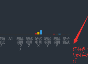
axisLabel: {
    interval: 0,
    formatter:function(value) {
     var ret = "";//拼接加\n返回的类目项
     var maxLength = 2;//每项显示文字个数
     var valLength = value.length;//X轴类目项的文字个数
     var rowN = Math.ceil(valLength / maxLength); //类目项需要换行的行数
     if (rowN > 1) { //如果类目项的文字大于3,
         for (var i = 0; i < rowN; i++) {
             var temp = "";//每次截取的字符串
             var start = i * maxLength;//开始截取的位置
             var end = start + maxLength;//结束截取的位置
             //这里也可以加一个是否是最后一行的判断,但是不加也没有影响,那就不加吧
             temp = value.substring(start, end) + "\n";
             ret += temp; //凭借最终的字符串
         }
         return ret;
     } else {
         return value;
     }
    }
}
方式3:X轴类目项隔一个换行
axisLabel: {
    interval: 0,
    formatter:function(value,index) {
        if (index % 2 != 0) {
            return '\n\n' + value;
        }  else {
            return value;
        }
    }
}
方式4. 文字排列2行,指定一行多少文字,多余用...
axisLabel: {
    interval: 0,
        // rotate: 40,
        // formatter: function (params) {
        //     var text_maxlength = 7
        //     if (params.length > text_maxlength) return params.substring(0, text_maxlength) + '...'
        //     else return params
        // },
        formatter: (value, index) => {
            if (!showEchart) { // 大于5条,才会出现显示不全,才需要 换行显示
                value = this.limitedLength(value, 7)
                return value;
            } else {
                value = this.limitedLength(value, 6);// 文字超长截取
                // 1. 每隔4个字换行 搭配 interval: 0
                // return this.getLabelName(value)
                // 2. 间隔 换行显示 搭配 interval: 0
                // if (index % 2 !== 0) {
                //     return '\n' + value;
                // } else {
                //     return value;
                // }
                // 3. 间隔不显示 搭配 interval: 1
                // return value;
                // 4. 文字排列最多2行,第一行4个字  搭配 interval: 0
                return this.lineFeed(value)
            }
        },
}
/**
* 文字超长截取
* @param value : 需要截取的字符串
* @param maxLength:超出截取的 最大长度
* @returns {*}
*/
limitedLength (value, maxLength) {
    if (value.length > maxLength) {
    	value = value.substring(0, maxLength) + '...';
    }
    return value;
},
/**
*  文本排列2行,第一行四个字
* @param value
* @param maxLength
* @returns {*}
*/
lineFeed (value) {
    if (value.length > 4) { // 文本需要换行
    const textArr = value.split('');
    textArr.splice(4,  0, '\n'); // 第五位添加一个换行符,用于文字换行
    	value = textArr.join('')
    }
    return value;
},
symbol 透明
itemStyle: {
    color: '#00FFF6',
    opacity: 1
},
symbol: 'image://' + require('@/assets/imgs/map/gc_icon_02.png'),
Echarts时间监听
myChart.getZr().on('click', (res)=>{ // 空白
    this.welfare = false
});
myChart.on('click', (res)=>{
    this.cleanse(res)
});
myChart.on('georoam', (res)=>{ // 移动or缩放
    this.cleanse(res)
});
2个柱子合并成一个
通过设置
stack属性为相同的值,将两个柱状图放置在同一个堆叠分组中。这样,它们就会合并到同一个柱子上,以堆叠的形式展示
option = {
  xAxis: {
    type: 'category',
    data: ['类别1', '类别2', '类别3'] // x 轴的数据
  },
  yAxis: {
    type: 'value'
  },
  series: [
    {
      name: '柱状图1',
      type: 'bar',
      stack: 'group', // 设置堆叠分组名称(可以是任意字符串)
      data: [100, 200, 300] // 第一个柱状图的数据
    },
    {
      name: '柱状图2',
      type: 'bar',
      stack: 'group', // 设置堆叠分组名称与第一个柱状图保持一致
      data: [150, 250, 350] // 第二个柱状图的数据
    }
  ]
};
y 轴刻度显示为整数
minInterval: 1 // 设置刻度之间的最小间隔为1
option = {
  // 其他配置项...
  yAxis: {
    type: 'value',
    minInterval: 1  // 设置刻度之间的最小间隔为1
  },
  // 其他配置项...
};
legend属性
1. icon属性
icon 提供了下面几种默认的格式 'circle', 'rect', 'roundRect', 'triangle', 'diamond', 'pin', 'arrow', 'none'
- circle:圆形
- rect:矩形
- roundRect:图标为一个圆角矩形
- triangle:图标为一个三角形
- diamond:图标为一个菱形
- pin:图标为一个地图标针(针头形状)
- arrow:图标为一个箭头
2. 没有显示
缺少
legend.data配置:legend的显示通常依赖于legend.data属性,它用来指定显示哪些系列(series)的名称。在你提供的代码中,legend没有data属性。因此,ECharts 无法知道要显示哪些项。你可以在
legend中添加data属性,指定你希望显示的系列名称。例如:legend: { itemWidth: 7, itemHeight: 7, left: 40, top: 0, textStyle: { color: '#333333', fontSize: 12, }, data: ['2020', '2019'] // 添加这里,指定要显示的系列名称 }series中缺少名称:legend显示的是series的name属性。如果series中的每个项都没有name,那么legend也无法显示任何内容。在你的代码中,某些series配置了空字符串作为name(例如:name: '')。你可以给这些series配置一个合适的name,或者确保legend.data中的系列名称与series中的name对应。例如,你可以将
name: ''改为合适的名称:series: [ { name: '2020', // 给系列命名 type: 'bar', barWidth: barWidth, barGap: '-100%', itemStyle: { color: new echarts.graphic.LinearGradient(0, 0, 1, 0, [ { offset: 0, color: 'rgba(81, 175, 255, 0.6)' }, { offset: 1, color: 'rgba(81, 175, 255, 1)' }, ], false), }, data: syjcl, }, // 其他系列... ]图表尺寸或位置问题: 如果
legend设置了left和top,但是这些值可能会导致它的位置在图表之外。你可以尝试调整left和top的值,确保legend位于图表的可视范围内。例如:
javascriptlegend: { itemWidth: 7, itemHeight: 7, left: 'center', // 更改为 'center' 或适当的值 top: 20, // 根据需要调整 textStyle: { color: '#333333', fontSize: 12, }, data: ['2020', '2019'] // 确保这里添加了数据 }透明度和颜色问题: 确保
legend和图表的颜色没有设置为相同的或透明度过低的颜色,导致legend看起来不可见。例如,在某些情况下,如果legend背景颜色过于透明,可能导致它无法显示。
总结
你需要做的主要修改是:
- 为
legend添加data属性,确保它知道哪些系列需要显示。 - 确保
series中的每个项都有合适的name属性。 - 调整
legend的位置,确保它在视图内。
修改后的 legend 代码示例:
javascriptlegend: {
    itemWidth: 7,
    itemHeight: 7,
    left: 'center',  // 中央位置
    top: 20,
    textStyle: {
        color: '#333333',
        fontSize: 12,
    },
    data: ['2020', '2019']  // 显示的系列名称
}
通过以上方法,legend 应该能够正确显示了。
3. 给每个图例标记 设置本地图片作为icon
        legend: {
          // icon: "rect",
          itemWidth: 20,  // 控制图标的宽度
          itemHeight: 20, // 控制图标的高度
          itemGap: 10,    // 图标之间的间距
          left: 'center',  // 居中显示
          textStyle: {
            fontSize: "14px",
            color: "#EFF7FF",
          },
          // data: ['隐患树障总量', '月份段内闭环数量'],  // 添加这里,指定要显示的系列名称
          data: [
            {
              name: '隐患树障总量',
              icon: 'image://' + require('@/assets/image/echarts/icon_001.png'),
            },
            {
              name: '月份段内闭环数量',
              icon: 'image://' + require('@/assets/image/echarts/icon_002.png'),
            },
          ],
          selectedMode: false,
        },
布局
- orient: 图例列表的布局朝向
horizontal: 水平排列vertical: 垂直排列- left/top/right/bottom : center/数值/百分比
    legend: {
        orient: 'vertical',  // 设置垂直排列
        left: 'center',      // 水平居中
        top: 'center',       // 垂直居中
        itemGap: 30,         // 设置项之间的间距
        textStyle: {
            color: '#ffffff', // 设置文字颜色
            fontSize: 12,      // 设置字体大小
        },
        formatter: seriesName => {
            if (!seriesName) return '';
            const checkItem = this_.getItemByName(seriesName);
            return `${seriesName} ${checkItem.originalValue}`;
        },
        data: ['危急', '严重', '一般'],
    },
使用图片
在 Vue 中使用本地图片作为
icon可以通过以下几种方式实现,具体取决于你所使用的组件和需求。下面是常见的几种方法。
方法一:使用 require 或 import 导入图片
Vue 在构建过程中支持 require 或 import 来引入本地的静态资源,比如图片。你可以这样做:
- 将图片放置在
assets文件夹中(通常是在src/assets)。 - 使用
require或import导入图片:
html<template>
  <div>
    <img :src="imgSrc" alt="icon" />
  </div>
</template>

<script>
export default {
  data() {
    return {
      imgSrc: require('@/assets/your-image.png'),  // 使用 require 导入图片
    };
  },
};
</script>
或者使用 import:
javascript<script>
import iconImage from '@/assets/your-image.png'; // 导入图片

export default {
  data() {
    return {
      imgSrc: iconImage,  // 将导入的图片路径赋值给 imgSrc
    };
  },
};
</script>
方法二:直接使用相对路径
如果图片放在 public 文件夹中,你可以直接通过相对路径引用图片,因为 public 文件夹中的文件会在构建时作为静态资源直接暴露。
- 将图片放置在
public文件夹中。 - 直接引用图片:
html<template>
  <div>
    <img src="/your-image.png" alt="icon" />
  </div>
</template>
在这种情况下,你不需要 require 或 import,因为 public 文件夹中的文件会直接被引用。
方法三:在 icon 中使用本地图片(例如 ECharts 图例) 【验证过是可以的】
如果你使用的是 ECharts 等库,需要将本地图片作为 legend 的 icon,可以使用图片的 URL 作为 icon 的值。对于 ECharts,可以这样做:
legend: {
  icon: 'image://' + require('@/assets/image/echarts/icon_001.png')
  itemWidth: 20,
  itemHeight: 20,
  itemGap: 10,
  data: ['Label 1', 'Label 2'],
}
方式四:URL 为图片链接例如
'image://http://example.website/a/b.png'

 // bas64
'image://data:image/gif;base64,R0lGODlhEAAQAMQAAORHHOVSKudfOulrSOp3WOyDZu6QdvCchPGolfO0o/XBs/fNwfjZ0frl3/zy7////wAAAAAAAAAAAAAAAAAAAAAAAAAAAAAAAAAAAAAAAAAAAAAAAAAAAAAAAAAAAAAAACH5BAkAABAALAAAAAAQABAAAAVVICSOZGlCQAosJ6mu7fiyZeKqNKToQGDsM8hBADgUXoGAiqhSvp5QAnQKGIgUhwFUYLCVDFCrKUE1lBavAViFIDlTImbKC5Gm2hB0SlBCBMQiB0UjIQA7'
注意事项:
- 使用
'image://' + require('@/assets/image/your-image.png')时,表示你在src目录下的assets文件夹内放置了图片,这个路径会通过 webpack 进行处理。 - 使用
@/assets/是 Vue CLI 的特性,它会自动解析为项目中的src目录。 - 如果图片位于
public文件夹中,可以直接使用/your-image.png,它会自动从public目录提供服务。
总结
- 如果你的图片放在
src/assets文件夹中,可以使用require或import引入。 - 如果图片放在
public文件夹中,直接通过相对路径引用即可。 - 在第三方库中(例如 ECharts)使用图片时,需要通过特定的格式(如
image://path)引用本地图片。
案例
案例2:包含后台数据处理
echarts+ajax动态获取后端数据 https://blog.csdn.net/u010452388/article/details/81877663

- java 部分
List<YdxjDundianTowers> mapList = ydxjDundianTowersService.dundianCountByStationECharts(ydxjDundianTowers);  普通的查询list方法
		List<String>  stationName = new ArrayList<String>();  //YJ站 作为  X轴
		List<String> notStart = new ArrayList<String>();//未开始
		List<String> startIng = new ArrayList<String>();//蹲守中
		List<String> endDundian = new ArrayList<String>();//终结
		for (YdxjDundianTowers b : mapList) {
			stationName.add(b.getStationName());
			notStart.add(b.getNotStart());
			startIng.add(b.getStartIng());
			endDundian.add(b.getEndDundian());
		}
		JSONObject json = new JSONObject();
		json.put("stationName", stationName);//YJ站
		json.put("notStart", notStart);//未开始
		json.put("startIng", startIng);//蹲守中
		json.put("endDundian", endDundian);//终结
		model.addAttribute("mapList", json.toJSONString());
- 前端
<body>
	<div id="chart" style="height:420px;width:100%;float: left;"></div>
	<%-- <div class="pagination">${page}</div> --%>
	<!-- Echart图表 -->
	<script src="${ctxStatic}/echarts/echarts-all.js" type="text/javascript"></script>
	<script src="${ctxStatic}/echarts/esl.js" type="text/javascript"></script>
	<script type="text/javascript">
		var myChart = echarts.init(document.getElementById('chart'));
		var chartDatas = ${mapList};
		var option = {
			 title : { text: 'YJ站分析柱状图'
				 },
		    tooltip : {
		        trigger: 'axis',
		        axisPointer : {            // 坐标轴指示器,坐标轴触发有效
		            type : 'shadow'        // 默认为直线,可选为:'line' | 'shadow'
		        }
		    },
		    legend: {
		        //data:['直接访问','邮件营销','联盟广告','视频广告','搜索引擎','百度','谷歌','必应','其他']
		       	data:['未开始','蹲守中','已终结']    //======================= 是对应 Y轴的name
		    },
		    grid: {
		        left: '3%',
		        right: '4%',
		        bottom: '3%',
		        containLabel: true
		    },
		    xAxis : [
		        {
		            type : 'category',
		       		data:chartDatas.stationName  //X 轴,,YJ站
		        }
		    ],
		    yAxis : [
		        {
		            type : 'value'
		        }
		    ],
		    series : [
		        {
		            name:'未开始',
		            type:'bar',
		            stack: 'YJ站',   //同一个  stack  会和合并在一起
		            data:chartDatas.notStart
		        },
		        {
		            name:'蹲守中',
		            type:'bar',
		            stack: 'YJ站',
		            data:chartDatas.startIng
		        },
		        {
		            name:'已终结',
		            type:'bar',
		            stack: 'YJ站',
		            data:chartDatas.endDundian
		        },
		        {
		            name:'已终结',
		            type:'bar',
		           // barWidth : 10,   //宽度
		            stack: 'YJ站',
		            data:chartDatas.endDundian,
		            markLine : {        //在柱状图中连线  能够开  趋势
 		                lineStyle: {
 		                    normal: {
 		                        type: 'dashed'
 		                    }
 		                },
 		                data : [
 		                    [{type : 'min'}, {type : 'max'}]
 		                ]
 		            }
		        },

		    ]
		};
		myChart.setOption(option);
	</script>
</body>
案例3 :环状图
https://www.makeapie.com/editor.html?c=xtLpob3FID
效果图

var  getvalue=[88];
option = {
    title: {
    text: getvalue+'分',
    textStyle: {
      color: '#28BCFE',
      fontSize: 40
    },
    subtext: '综合得分',
        subtextStyle: {
            color: '#666666',
            fontSize: 30
        },
	itemGap: 20,
    left: 'center',
    top: '43%'
	},
    tooltip: {// Tips 提示。点击 内容区域提示信息
        formatter: function (params) {
            return '<span style="color: #fff;">综合得分:'+ getvalue + '分</span>';
        }
    },
  angleAxis: {
    max: 100,
    clockwise: true, // 逆时针
    show: false// 隐藏刻度线
  },
  radiusAxis: {
        type: 'category',
        show: true,
        axisLabel: {
            show: false,
        },
        axisLine: {
            show: false,
        },
        axisTick: {
            show: false
        },
  },
  polar: {
    center: ['50%', '50%'],
    radius: '100%' //图形大小
  },
  series: [{
    type: 'bar',
    data: getvalue,
	showBackground: true,
	backgroundStyle: {
		color: '#BDEBFF',
	},
    coordinateSystem: 'polar',
    roundCap: true,
    barWidth: 30,
    itemStyle: {// 修改圆环 颜色,设置渐变色
        normal: {
        opacity: 1,
        color:  new echarts.graphic.LinearGradient(0, 0, 0, 1, [{
            offset: 0,
            color: '#25BFFF'
          }, {
            offset: 1,
            color: '#5284DE'
          }]),
        shadowBlur: 5,
        shadowColor: '#2A95F9',
    }
    },
  }]
};
案例4 说明

<!DOCTYPE html>
<html>
<head>
	<title>echarts</title>
</head>
<script src="js/jquery-1.11.1.min.js"></script>
<script type="text/javascript" src="js/echarts.min.js"></script>

<body style="background-color:#333;"><!--  -->
	<div id="_top" style="width:600px;height: 400px;margin-top:100px;margin-left: 300px;">
	</div>
</body>
<script type="text/javascript">
	 // 基于准备好的dom,初始化echarts实例
	 var myChart = echarts.init(document.getElementById('_top'));

	 // 指定图表的配置项和数据
        var option = {
            grid: {// 设置图形位置
                top: '13%',
                left: '10%',
                right: '1%',
                bottom: '20%',
              },
        	//--------------    标题 title  ----------------
            title: {
                text: '主标题',
                textStyle:{					//---主标题内容样式
                	color:'#fff'
                },

                subtext:'副标题',			//---副标题内容样式
                subtextStyle:{
                	color:'#bbb'
                },

                padding:[0,0,100,100]				//---标题位置,因为图形是是放在一个dom中,因此用padding属性来定位

            },

           	//----------------   图例 legend  -----------------
            legend: {
            	type:'plain',				//----图例类型,默认为'plain',当图例很多时可使用'scroll'
            	top:'1%',					//----图例相对容器位置,top\bottom\left\right
            	selected:{
            		'销量':true,			//----图例选择,图形加载出来会显示选择的图例,默认为true
            	},
            	textStyle:{					//----图例内容样式
            		color:'#fff',				//---所有图例的字体颜色
            		//backgroundColor:'black',	//---所有图例的字体背景色
            	},
            	tooltip:{					//图例提示框,默认不显示
            		show:true,
            		color:'red',
            	},
                data:[						//----图例内容
                	{
                		name:'销量',
                		icon:'circle',			//----图例的外框样式
                		textStyle:{
                			color:'#fff',		//----单独设置某一个图例的颜色
                			//backgroundColor:'black',//---单独设置某一个图例的字体背景色
                		}
                	}
                ],
            },

            //--------------   提示框 -----------------
            tooltip: {
            	show:true,					//---是否显示提示框,默认为true
            	trigger:'item',				//---数据项图形触发
            	axisPointer:{				//---指示样式
            		type:'shadow',
            		axis:'auto',

            	},
            	padding:5,
            	textStyle:{					//---提示框内容样式
            		color:"#fff",
            	},
            },

            //-------------  grid区域  ----------------
            grid:{
            	show:false,					//---是否显示直角坐标系网格
            	top:80,						//---相对位置,top\bottom\left\right
            	containLabel:false,			//---grid 区域是否包含坐标轴的刻度标签
            	tooltip:{					//---鼠标焦点放在图形上,产生的提示框
            		show:true,
            		trigger:'item',			//---触发类型
            		textStyle:{
            			color:'#666',
            		},
            	}
            },

            //-------------   x轴   -------------------
            xAxis: {
            	show:true,					//---是否显示
            	position:'bottom',			//---x轴位置
            	offset:0,					//---x轴相对于默认位置的偏移
            	type:'category',			//---轴类型,默认'category'
            	name:'月份',				//---轴名称
            	nameLocation:'end',			//---轴名称相对位置
            	nameTextStyle:{				//---坐标轴名称样式
            		color:"#fff",
            		padding:[5,0,0,-5],	//---坐标轴名称相对位置
            	},
            	nameGap:15,					//---坐标轴名称与轴线之间的距离
            	//nameRotate:270,			//---坐标轴名字旋转
            	axisLine:{					//---坐标轴 轴线
            		show:true,					//---是否显示
            		//------------------- 箭头 -------------------------
            		symbol:['none', 'arrow'],	//---是否显示轴线箭头
            		symbolSize:[8, 8] ,			//---箭头大小
            		symbolOffset:[0,7],			//---箭头位置

            		//------------------- 线 -------------------------
            		lineStyle:{
            			color:'#fff',
            			width:1,
            			type:'solid',
            		},
            	},
            	axisTick:{					//---坐标轴 刻度
            		show:true,					//---是否显示
            		inside:true,				//---是否朝内
            		lengt:3,					//---长度
            		lineStyle:{
            			//color:'red',			//---默认取轴线的颜色
            			width:1,
            			type:'solid',
            		},
            	},
            	axisLabel:{					//---坐标轴 标签
            		show:true,					//---是否显示
            		inside:false,				//---是否朝内
            		rotate:0,					//---旋转角度
            		margin: 5,					//---刻度标签与轴线之间的距离
            		//color:'red',				//---默认取轴线的颜色
                    formatter: function (val) {// 设置 x轴 文件 竖向排列
                      return val.split('').join('\n');
                    },
            	},
            	splitLine:{					//---grid 区域中的分隔线
            		show:false,					//---是否显示,'category'类目轴不显示,此时我的X轴为类目轴,splitLine属性是无意义的
            		lineStyle:{
            			//color:'red',
            			//width:1,
            			//type:'solid',
            		},
            	},
            	splitArea:{					//--网格区域
            		show:false,					//---是否显示,默认false
            	},
                data: ["1月","2月","3月","4月","5月","6月","7月","8月","9月","10月","11月","12月"],//内容
            },

            //----------------------  y轴  ------------------------
            yAxis: {
            	show:true,					//---是否显示
            	position:'left',			//---y轴位置
            	offset:0,					//---y轴相对于默认位置的偏移
            	type:'value',			//---轴类型,默认'category'
            	name:'销量',				//---轴名称
            	nameLocation:'end',			//---轴名称相对位置value
            	nameTextStyle:{				//---坐标轴名称样式
            		color:"#fff",
            		padding:[5,0,0,5],	//---坐标轴名称相对位置
            	},
            	nameGap:15,					//---坐标轴名称与轴线之间的距离
            	//nameRotate:270,			//---坐标轴名字旋转

            	axisLine:{					//---坐标轴 轴线
            		show:true,					//---是否显示

            		//------------------- 箭头 -------------------------
            		symbol:['none', 'arrow'],	//---是否显示轴线箭头
            		symbolSize:[8, 8] ,			//---箭头大小
            		symbolOffset:[0,7],			//---箭头位置

            		//------------------- 线 -------------------------
            		lineStyle:{
            			color:'#fff',
            			width:1,
            			type:'solid',
            		},
            	},
            	axisTick:{					//---坐标轴 刻度
            		show:true,					//---是否显示
            		inside:true,				//---是否朝内
            		lengt:3,					//---长度
            		lineStyle:{
            			//color:'red',			//---默认取轴线的颜色
            			width:1,
            			type:'solid',
            		},
            	},
            	axisLabel:{					//---坐标轴 标签
            		show:true,					//---是否显示
            		inside:false,				//---是否朝内
            		rotate:0,					//---旋转角度
            		margin: 8,					//---刻度标签与轴线之间的距离
            		//color:'red',				//---默认取轴线的颜色
            	},
            	splitLine:{					//---grid 区域中的分隔线
            		show:true,					//---是否显示,'category'类目轴不显示,此时我的y轴为类目轴,splitLine属性是有意义的
            		lineStyle:{
            			color:'#666',
            			width:1,
            			type:'dashed',			//---类型
            		},
            	},
            	splitArea:{					//--网格区域
            		show:false,					//---是否显示,默认false
            	}
            },

            //------------ 内容数据  -----------------
            series: [
	            {
	                name: '销量',				//---系列名称
	                type: 'bar',				//---类型
	                legendHoverLink:true,		//---是否启用图例 hover 时的联动高亮
	                label:{						//---图形上的文本标签
	                	show:false,
	                	position:'insideTop',	//---相对位置
	                	rotate:0,				//---旋转角度
	                	color:'#eee',
	                },
	                itemStyle:{					//---图形形状
	                	color:'blue',
	                	barBorderRadius:[18,18,0,0],
	                },
	                barWidth:'20',				//---柱形宽度
	                barCategoryGap:'20%',		//---柱形间距
	                data: [3020, 4800, 3600, 6050, 4320, 6200,5050,7200,4521,6700,8000,5020]
	            }
            ]
        };

        // 使用刚指定的配置项和数据显示图表。
        myChart.setOption(option);
</script>
</html>
案例4 柱装图 & x轴 文字换行

var myChart = echarts.init(document.getElementById('tdYhtj'));
        var option = {
          legend: {
            icon: 'circle',
            data: ['隐患', '缺陷'],
            align: 'right',
            right: 10,
            textStyle: {
              color: '#999999',
              fontSize: 12,
            },
            itemWidth: 7,
            itemHeight: 7,
            itemGap: 35,
          },
          grid: {
            top: '15%',
            left: '3%',
            right: '4%',
            bottom: '6%',
            containLabel: true,
          },
          xAxis: [
            {
              type: 'category',
              data: xData,
              axisLine: {
                show: true,
                lineStyle: {
                  color: '#F5F5F5',
                  width: 1,
                  type: 'solid',
                },
              },
              axisTick: {
                show: false,
              },
              axisLabel: {
                show: true,
                textStyle: {
                  color: '#999999',
                  fontSize: 12,
                },
                formatter: function (params) {// 格式化 x轴 字体显示(这里主要是 文字超过一半换行)
                  var newParamsName = '';
                  var paramsNameNumber = params.length;
                  var provideNumber = 2; //一行显示几个字
                  var rowNumber = Math.ceil(paramsNameNumber / provideNumber);
                  if (paramsNameNumber > provideNumber) {
                    for (var p = 0; p < rowNumber; p++) {
                      var tempStr = '';
                      var start = p * provideNumber;
                      var end = start + provideNumber;
                      if (p == rowNumber - 1) {
                        tempStr = params.substring(start, paramsNameNumber);
                      } else {
                        tempStr = params.substring(start, end) + '\n';
                      }
                      newParamsName += tempStr;
                    }
                  } else {
                    newParamsName = params;
                  }
                  return newParamsName;
                },
              },
            },
          ],
          yAxis: [
            {
              name: '数量',
              nameTextStyle: {
                color: '#999999',
              },
              type: 'value',
              axisLabel: {
                formatter: '{value}',
                textStyle: {
                  color: '#999999',
                  fontSize: 12,
                },
              },
              axisTick: {
                show: false,
              },
              axisLine: {
                show: true,
                lineStyle: {
                  color: '#F5F5F5',
                  width: 1,
                  type: 'solid',
                },
              },
              splitLine: {
                lineStyle: {
                  color: '#F5F5F5',
                },
              },
            },
          ],
          series: [
            {
              name: '隐患',
              type: 'bar',
              data: yhData,
              barWidth: 10, //柱子宽度
              barGap: '20%', //柱子之间间距
              itemStyle: {
                normal: {
                  color: new echarts.graphic.LinearGradient(0, 0, 0, 1, [
                    {
                      offset: 0,
                      color: '#FFA800',
                    },
                    {
                      offset: 1,
                      color: '#FE8B0C',
                    },
                  ]),
                  opacity: 1,
                },
              },
            },
            {
              name: '缺陷',
              type: 'bar',
              data: qxData,
              barWidth: 10,
              barGap: '20%',
              itemStyle: {
                normal: {
                  color: new echarts.graphic.LinearGradient(0, 0, 0, 1, [
                    {
                      offset: 0,
                      color: '#FC767E',
                    },
                    {
                      offset: 1,
                      color: '#FE3945',
                    },
                  ]),
                  opacity: 1,
                },
              },
            },
          ],
        };
        myChart.setOption(option);
文字竖向排列
axisLabel:{					//---坐标轴 标签
            		show:true,					//---是否显示
            		inside:false,				//---是否朝内
            		rotate:0,					//---旋转角度
            		margin: 5,					//---刻度标签与轴线之间的距离
            		//color:'red',				//---默认取轴线的颜色
                    formatter: function (val) {// 设置 x轴 文件 竖向排列
                      return val.split('').join('\n');
                    },
            	}
案例5 折现和柱装图 & 光标移入 提示 & 每个柱图颜色不一样

function getElecBarOption() {
              var option={
                  tooltip: {// 光标移入tips 提示
                      trigger: 'axis',
                          formatter: (params) => {
                          return params[0].seriesName + ': ' + params[0].data + '<br>' + params[1].seriesName + ': ' + params[1].data + '%'
                      }
                  },
                  legend: {
                      data:['投保门店数','门店参与率']
                  },
                  xAxis: [
                      {
                          type: 'category',
                          data: ['1月','2月','3月','4月','5月','6月','7月','8月','9月','10月','11月','12月']
                      }
                  ],
                      yAxis: [
                      {
                          type: 'value',
                          name: '数量',
                          interval: 50,
                          axisLabel: {
                              formatter: '{value} '
                          }
                      }, {
                          type: 'value',
                          name: '门店参与率',
                          min: 0,
                          max: 100,
                          interval: 10,
                          axisLabel: {
                              formatter: '{value} %'
                          }
                      }
                  ],
                      series: [
                      {
                          name:'投保门店数',
                          type:'bar',
                          /*设置柱状图颜色*/
                          itemStyle: {
                              normal: {
                                  color: function(params) {
                                      var colorList = [
                                          '#fe4f4f','#fead33','#feca2b','#fef728','#c5ee4a',
                                          '#87ee4a','#46eda9','#47e4ed','#4bbbee','#7646d8',
                                          '#924ae2','#C6E579','#F4E001','#F0805A','#26C0C0'
                                      ];
                                      return colorList[params.dataIndex]
                                  },
                                  /*信息显示方式*/
                                  label: {
                                      show: true,
                                      position: 'top',
                                      formatter: '{b}\n{c}'
                                  }
                              }
                          },
                          data:[50, 75, 100, 150, 200, 250, 150, 30, 95, 160, 50, 45]
                      },
                      {
                          name:'门店参与率',
                          yAxisIndex: 1, //这里要设置哪个y轴,默认是最左边的是0,然后1,2顺序来。
                          type:'line',
                          itemStyle : {  /*设置折线颜色*/
                              normal : {
                                  // color:'#c4cddc'
                              }
                          },
                          data:[10, 75, 80, 20, 20, 25, 15, 10, 95, 16, 50, 45]
                      }
                  ]
              }
              return option;
          }
案例6

$scope.getjcyjChart = function(xData, yData1, yData2) {
    var myChart = echarts.init(document.getElementById('jcyjChart'));
    var option = {
        grid: {
            top: '13%',
            left: '10%',
            right: '12%',
            bottom: '20%',
        },
        legend: {
            //icon: "circle",
            itemWidth: 7,
            itemHeight: 7,
            left: 40,
            top: 0,
            textStyle: {
                color: '#333333',
                fontSize: 12,
            },
        },
        xAxis: [{
            type: 'category',
            data: xData,
            axisTick: {
                show: false, // 是否显示坐标轴轴线
            },
            axisLabel: {
                color: '#9E9E9E',
                fontSize: 11,
                formatter: function(val) {
                    return val.split('').join('\n');
                },
            },
            splitLine: {
                show: false,
            },
            boundaryGap: true,
            axisLine: {
                //坐标轴轴线相关设置。
                show: true,
                inside: false,
                lineStyle: {
                    color: '#F3F4F6',
                },
            },
        }, ],
        yAxis: [{
            type: 'value',
            min: 0,
            splitNumber: 5,
            splitLine: {
                show: true
            },
            axisLabel: {
                //坐标轴刻度标签的相关设置。
                formatter: '{value}',
                show: true,
                textStyle: {
                    color: '#9E9E9E',
                    fontSize: 11,
                },
            },
            axisLine: {
                show: true,
                lineStyle: {
                    color: '#F3F4F6',
                },
            },
            axisTick: {
                show: false,
            },
            splitLine: {
                lineStyle: {
                    color: '#F3F4F6',
                    type: 'dashed',
                },
            },
            show: true,
        }, ],
        series: [{
            type: 'bar',
            barMaxWidth: 7,
            name: '已检测',
            data: yData1,
            showBackground: true,
            backgroundStyle: {
                color: '#F5F5F5'
            },
            itemStyle: {
                normal: {
                    color: {
                        type: 'linear',
                        x: 0,
                        y: 0,
                        x2: 0,
                        y2: 1,
                        colorStops: [{
                            offset: 0,
                            color: '#469DFF',
                        }, {
                            offset: 1,
                            color: '#2D64F5',
                        }, ],
                        global: false, //  缺省为  false
                    },
                    barBorderRadius: [2, 2, 0, 0],
                },
            },
            // label: {
            //   normal: {
            //     show: true,
            //     fontSize: 11,
            //     color: '#9E9E9E',
            //     position: 'top',
            //     formatter: function (data) {
            //       return data.value;
            //     },
            //   },
            // },
        }, {
            type: 'bar',
            barMaxWidth: 7,
            name: '不合格',
            data: yData2,
            showBackground: true,
            backgroundStyle: {
                color: '#F5F5F5'
            },
            barGap: '0%',
            /*多个并排柱子设置柱子之间的间距*/
            barCategoryGap: '0%',
            /*多个并排柱子设置柱子之间的间距*/
            itemStyle: {
                normal: {
                    color: {
                        type: 'linear',
                        x: 0,
                        y: 0,
                        x2: 0,
                        y2: 1,
                        colorStops: [{
                            offset: 0,
                            color: '#FFA800',
                        }, {
                            offset: 1,
                            color: '#FE8B0C',
                        }, ],
                        global: false, //  缺省为  false
                    },
                    barBorderRadius: [2, 2, 0, 0],
                },
            },
            // label: {
            //   normal: {
            //     show: true,
            //     fontSize: 11,
            //     color: '#9E9E9E',
            //     position: 'top',
            //     formatter: function (data) {
            //       return data.value;
            //     },
            //   },
            // },
        }, ],
    };
    myChart.setOption(option);
    myChart.getZr().on('click', function(params) {
        console.log(params)
        var pointInPixel = [params.offsetX, params.offsetY];
        if (myChart.containPixel('grid', pointInPixel)) {
            //获取当前点击的索引值
            //注意:若柱状图为纵向则获取x轴的索引,若柱状图为横向则需获取y轴的索引(见下方注释)
            var xIndex = myChart.convertFromPixel({
                seriesIndex: 0
            }, pointInPixel)[0];
            var xData = option.xAxis[0].data[xIndex]; //当前点击柱子的数据
            console.log(xData);
            // var yIndex=myChart.convertFromPixel({seriesIndex:0},pointInPixel)[1];
            // var yData=option.yAxis[0].data[yIndex];//当前点击柱子的数据
            //var id = dyValueMap.get(xData);
            // $scope.gotoLineList("", id);
        }
    })
}
案例7:饼图控制 legend位置
legend换行

   //你的代码
   legend:[
      {
         orient:'vertical',
         right:'22%',
         top:'35%',
         itemGap:30,
         textStyle:{
            color:'#ffffff',
            fontSize:12,
         },
         data:['1月','2月','3月','4月','5月','6月'],
      },
      {
         orient:'vertical',
         right:'3%',
         top:'35%',
         itemGap:30,
         textStyle:{
            color:'#ffffff',
            fontSize:12,
         },
         data:['7月','8月','9月','10月','11月','12月'],
      }
   ],
15.5 定义单击事件
myChart.setOption(option);
myChart.getZr().on('click', function (params){
    var pointInPixel = [params.offsetX, params.offsetY];
    if (myChart.containPixel('grid', pointInPixel)) {
        //获取当前点击的索引值
        //注意:若柱状图为纵向则获取x轴的索引,若柱状图为横向则需获取y轴的索引(见下方注释)
        var xIndex = myChart.convertFromPixel({seriesIndex: 0}, pointInPixel)[0];
        var xData = option.xAxis[0].data[xIndex];//当前点击柱子的数据
        console.log(xData);
        // var yIndex=myChart.convertFromPixel({seriesIndex:0},pointInPixel)[1];
        // var yData=option.yAxis[0].data[yIndex];//当前点击柱子的数据
        //var id = dyValueMap.get(xData);
        // $scope.gotoLineList("", id);
    }
})
// 考虑 不能绑定字段 故,在处理数据时构造 map对象,通过key 获取value
var dyValueMap = new Map();

dyValueMap.set(key, value);// key 是x轴上的显示的名称
15.10 用来设置Echatrs的自适应
window.onresize = function () {
	myChart.resize({width:window.innerWidth, height:window.innerHeight});
}
15.11 设置渐变色
series: [{
            type: 'bar',
            data: [, , xsl],
            coordinateSystem: 'polar',
            barMaxWidth: 23,
            z: 2,
            name: '巡视率',
            roundCap: true,
            itemStyle: {
              normal: {
                color: {
                  type: 'linear',
                  colorStops: [
                    // !! 在此添加想要的渐变过程色 !!
                    {
                      offset: 0,
                      color: '#436CF5'
                    },
                    {
                      offset: 1,
                      color: '#68A2F7'
                    }
                  ]
                },
              }
            },
            barGap: '-100%',
          }, {
            type: 'bar',
            data: [, , 100],
            z: 0,
            silent: true,
            coordinateSystem: 'polar',
            barMaxWidth: 23,
            name: 'C',
            roundCap: true,
            color: '#F1F3F8',
            barGap: '-100%',
          }],
15.12 数据更新后不自然
场景说明:点击地图下钻后,重现加载数据,会发现上一层的数据会在当前图层下闪一下
处理方法:下钻地图时先data进行清空(data清空和地图加载同时),然后再重现赋值

updateMap (name, type) {
    const [mapName, mapJson] = getMap(name)
    this.showLegend(name, type)
    this.getAreaCenter(mapJson) //  获取地图区域中心点,全国,和省下
    // option.geo.zoom = 0.8 // 后期可能需要考虑 低图层 需要进行缩放
    // 就像上面提到的,这里必须要和注册地图时的名字一致
    option.geo[0].map = mapName
    option.geo[0].center = ''
    option.geo[1].map = mapName
    option.geo[1].center = ''
    // 注册地图
    echarts.registerMap(mapName, mapJson)// 需要和 option.geo.map = 'mapName,'  对应上
    // ===================## 重新渲染 --- 这里很重要,如果不先清空 数据,否则会出现数据更新不自然 ##===================
    if (option.series.length > 0) { // 说明当前还未添加 series 属性
        // 重新渲染 option.series[0].data = arr
        option.series.forEach(item => {
            item.data = [] // 核心就是对 data 先置空,否则 会出现 数据更新 不自然 直接 option.series = [] 是不行的
        })
    }
    this.myChart.setOption(option)
    this.loadData() // 数据查询-- 地图数据加载
},
    // 显示图例和 记录当前层级(全国,省,市)
    showLegend (name, type) {
        console.log('当前:' + this.type_model)
        if (type === 'china') {
            this.chooseCity = ['中国']
            this.type_model.subType = this.chooseCity.length // 记录当前 省市级别
            return
        }
        if (type === 'city') {
            this.chooseCity.pop()
            this.type_model.subType = this.chooseCity.length // 记录当前 省市级别
            return
        }
        this.chooseCity.push(name)
        // 通过 判断当前记录城市 数量,如果当前数量为3 则表示当前市市级,需要获取 当前城市的 图标,作为图例
        if (this.chooseCity.length === 3) { // 需要显示全国和 当前城市
            this.cityIcon = cityIconMap[this.chooseCity[1]]
        }
        this.type_model.subType = this.chooseCity.length // 记录当前 省市级别
    },
        /* 数据查询 */
        async loadData () {
            const res = await this.axiosApiFormdata('getData', this.type_model, 'POST')
            if (res.code === 200) {
                this.initData(res.data)
            } else {
                this.initData([])
            }
        },
            initData (arr) {
                arr.forEach(item => {
                    if (this.areaCenter[item.name]) {
                        item.value = this.areaCenter[item.name].concat(item.value)
                        item.title = '工程总数'
                    }
                })
                this.getColor(arr) // 根据 数据量大小,进行排序 给 symbol 进行标记不同颜色

                if (option.series.length === 0) { // 说明当前还未添加 series 属性
                    option.series = seriesData
                }
                // 重新渲染 option.series[0].data = arr
                option.series.forEach(item => {
                    item.data = arr
                })
                this.myChart.setOption(option)
            },
折线图
折现平滑
initEcharts (domId) {
                const myChart = echarts.init(document.getElementById('main'))
                const option = {
                    backgroundColor: 'rgba(0,0,0,0)', // '#013954',
                    grid: {
                        left: '1%',
                        right: '1%',
                        top: '2%',
                        bottom: '5%',
                        containLabel: true
                    },
                    xAxis: {
                        type: 'category',
                        data: ['11-26', '11-27', '11-28', '11-29', '11-30', '12-01', '12-02'],
                        boundaryGap: true,
                        axisTick: {
                            show: false
                        },
                        axisLabel: {
                            show: false
                        }
                    },
                    yAxis: {
                        type: 'value',
                        axisLabel: {
                            show: false
                        }
                    },
                    series: [
                        {
                            name: '最低气温',
                            type: 'line',
                            smooth: true,
                            showSymbol: false,
                            data: [0, -1, -3, -4, 0, -2, -4],
                            itemStyle: {
                                normal: {
                                    color: '#006CFF'
                                }
                            },
                            lineStyle: {
                                normal: {
                                    width: 3
                                }
                            }
                        },
                        {
                            name: '最高气温',
                            type: 'line',
                            smooth: true, // 是否平滑曲线显示
                            showSymbol: false, // 不显示 折点
                            data: [9, 10, 6, 7, 12, 11, 8],
                            itemStyle: {
                                normal: {
                                    color: '#06F5FF'
                                }
                            },
                            lineStyle: {
                                normal: {
                                    width: 2
                                }
                            }
                        }

                    ]
                }
                myChart.setOption(option)
            }
动态折线图
<script>
import * as echarts from 'echarts'
import { closeWebSocket, createWebSocket } from '@/utils/socket'
export default {
/**
* 说明:体征检测
*/
name: 'tzJcCard',
components: {},
data () {
return {
deviceId: '', // 设备id(目前这些设备是不和人直接关联的,人员列表中包含设备id,所以通过设备id进行关联)
interval: 2, // 定时器 间隔时间设置定时器触发时间
chartsMap: {}, // 用来存储 创建的 echarts对象,否则我需要创建3个
dataMap: {
xl: [], // 实时心率 数据
xy: [], // 血氧浓度 数据
tw: [] // 体温检测 数据
},
normal_values: {
xl: {
normal_range: [60, 100],
size_range: [50, 110],
name: '实时心率'
}, // 心率正常值范围为 60 到 100 ( normal_range 正常值 size_range y轴显示区间)
xy: {
normal_range: [95, 100],
size_range: [90, 110],
name: '血氧浓度'
}, // 血氧浓度正常值范围为 95 到 100
tw: {
normal_range: [36.5, 37.5],
size_range: [35, 45],
name: '体温检测'
} // 体温正常值范围为 36.5 到 37.5
}
}
},
// 初始化页面完成后
mounted () {
const intervalId = setInterval(() => {
console.log('定时加载数据...')
const data = {
xl: [
{
time: '8:00',
value: 70
},
{
time: '8:05',
value: 75
},
{
time: '8:10',
value: 80
},
{
time: '8:15',
value: 85
},
{
time: '8:20',
value: 90
},
{
time: '8:25',
value: 95
}
]
}
// 心率 折线图初始化
for (const key in data) {
this.dataMap[key].push(...data[key])
this.updateXlChar(key) // 心率 折线图
}
clearInterval(intervalId); // 停止定时器
}, 5000)
},
created () {
this.loadData('H001') // 数据加载
},
methods: {
// 数据加载 -- 定时更新 取最新记录(每次查询最新10记录,由x轴时间比对,判断是否添加过,从而执行最新记录添加)
async loadData (deviceId) {
this.deviceId = deviceId // 这里记录下来,主要是 后面 数据更新,防止其他人员串到当前人员下
console.log(1)
const res = await this.$axiosApiFormdata('/ddzyLargeScreenApi/getTzjcData', { worksiteid: 1, deviceId: deviceId }, 'POST')
console.log(res)
console.log('-------------------')
if (res && res.code === 200 && res.data) {
// 拿到心率数据 this.xlChart this.xlRange
}
const data = {
xl: [
{
time: '8:00',
value: 70
},
{
time: '8:05',
value: 75
},
{
time: '8:10',
value: 80
},
{
time: '8:15',
value: 85
},
{
time: '8:20',
value: 90
},
{
time: '8:25',
value: 95
}
]
}
// 心率 折线图初始化
for (const key in data) {
this.dataMap[key] = [];// 初始化需要重置
this.dataMap[key].push(...data[key])
this.initEcharts(key) // 心率 折线图
}
console.log(2)
this.initWebSocket() // 数据加载完成后 交由 webSocket 进行接受,这样可以避免 需要定时加载加载数据
console.log(3)
},
initEcharts (type) {
// 创建 echarts 对象
if (!this.chartsMap[type]) {
this.chartsMap[type] = echarts.init(document.getElementById(`${type}Main`))
}
// 组装数据
const data = this.dataMap[type]; // 拿到当前 类型的数据--主要是因为需要对数据进行不停的移除第一个然后追加,实现 数据的实时滚动
const length = data.length || 0
const xData = []
const yData = []
data.forEach(item => {
xData.push(item.time)
yData.push(item.value)
})
const constItem = this.normal_values[type] // 记录了 区间,名称
// 补全区间
const maxData = Array.from({ length: length }).fill(constItem.normal_range[1]) // 初始化是补全 最大
const minData = Array.from({ length: length }).fill(constItem.normal_range[0]) // 初始化是补全 最小值
const option = {
backgroundColor: 'rgba(0,0,0,0)', // '#013954',
grid: {
left: '1%',
right: '1%',
top: '2%',
bottom: '5%',
containLabel: true,
show: false
},
tooltip: {
trigger: 'axis',
axisPointer: {
lineStyle: {
color: 'rgba(255,255,255,0.7)'
}
},
backgroundColor: 'rgba(255,255,255,0.1)',
textStyle: {
color: 'rgb(255,255,255)'
},
formatter: function (params) {
var res = params[0].name + '<br/>' + params[0].seriesName + ' : ' + params[0].value
return res
}
},
animationDurationUpdate: 1000, // 数据更新时的动画时间为 1 秒
xAxis: {
type: 'category',
// data: xData, // 添加上也可以,只是在下面的 动态 构造中 不能取修改 x轴数据,否则无法实现动态
boundaryGap: true,
axisTick: {
show: false
},
axisLabel: {
show: false
}
},
yAxis: {
type: 'value',
axisLabel: {
show: false
},
min: constItem.size_range[0],
max: constItem.size_range[1], // 控制显示区间,防止 折线图 所占区域小
splitLine: {
// show: false
lineStyle: {
type: 'dashed',
color: 'rgba(255,255,255,0.2)'// ['rgba(255,255,255,0.2)', 'rgba(221,221,221,0.6)'] // 使用深浅的间隔色
}
}
},
series: [
{
name: constItem.name,
type: 'line',
smooth: true,
showSymbol: false,
data: yData,
lineStyle: {
normal: {
width: 3
}
}
},
{
type: 'line',
smooth: true, // 是否平滑曲线显示
showSymbol: false, // 不显示 折点
data: maxData,
lineStyle: {
normal: {
type: 'dashed',
color: '#00FF0480',
width: 2
}
}
},
{
type: 'line',
smooth: true, // 是否平滑曲线显示
showSymbol: false, // 不显示 折点
data: minData,
lineStyle: {
normal: {
type: 'dashed',
color: '#00FF0480',
width: 2
}
}
}
]
}
this.chartsMap[type].setOption(option);
this.dataMap[type] = [];// 数据被用掉了,需要及时清除
},
// 更新心率数据
updateXlChar (type) {
if (!this.chartsMap[type]) { // 说明没初始化好
this.initEcharts(type);
return;
}
const data = this.dataMap[type]; // 拿到当前 类型的数据--主要是因为需要对数据进行不停的移除第一个然后追加,实现 数据的实时滚动
const constItem = this.normal_values[type] // 记录了 区间,名称
// 启动定时器
const intervalId = setInterval(() => {
if (!this.dataMap[type] || this.dataMap[type].length === 0) {
clearInterval(intervalId); // 停止定时器
}
console.log(this.dataMap[type][0].time)
const options = this.chartsMap[type].getOption() // 获得option对象
// 不能修改否会出现异常
// options.xAxis[0].data.shift(); // 删除第一个数据点
// options.xAxis[0].data.push(this.dataMap[type][0].time); // 添加一个新数据点
// y轴数据
options.series[0].data.shift(); // 删除第一个数据点
options.series[0].data.push(this.dataMap[type][0].value); // 添加一个新数据点
this.dataMap[type].shift(); // 拿掉一个删除一个
// 区间 最大值
options.series[1].data.shift(); // 删除第一个数据点
options.series[1].data.push(constItem.normal_range[1]); // 添加一个新数据点
// 区间 最小值
options.series[2].data.shift(); // 删除第一个数据点
options.series[2].data.push(constItem.normal_range[0]); // 添加一个新数据点
this.chartsMap[type].setOption(options) // 设置option
console.log(data);
}, this.interval * 1000); // 按间隔时间设置定时器触发时间
},
initWebSocket () {
// createWebSocket(res => {
// console.log('webSocket 连接.....');
// console.log(res);
// this.updateXlChar();
// })
}
}
}
</script>
echarts折线图如何防止label重叠,实现一上一下的效果
https://blog.csdn.net/qq_40128375/article/details/127094837
echartsLabelPositionArr: ['top', 'bottom'], // echarts label 位置,主要是 防止label重叠,实现一上一下的效果
label: {
    show: true,        // 显示标签
    color: '#CCD2D9',     // 标签文字颜色
    fontSize: 10,       // 标签文字大小
    formatter: (params) => { // 实现
     	const arr = this.getPosition(params.dataIndex) === 'bottom' ? ['{bottomStyle|' + params.value + '}'] : [params.value];
     	return arr.join('');
    },
    textStyle: {
        rich: {
            bottomStyle: {
                padding: [0, 0, -50, 0],
                fontSize: 10
            }
        }
   }
}
getPosition(index) {
                const indexx = index % this.echartsLabelPositionArr.length; // ['bottom', 'top']
                console.log(index, indexx)
                return this.echartsLabelPositionArr[indexx];
            }
进度条
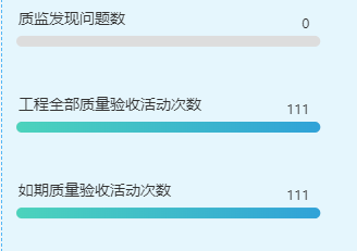
function initcbChart (yData) {
            const data = yData.map(item => item || 0); // 防止有undefined 的项出现,所以过滤一遍数据,以0 补全
            var max = Math.max(...data)
            if(max == 0){ max=1 } // 如果不这样设置,当数值全部为0 则无法 显示柱体
            const maxData = Array.from({ length: data.length }, () => max);
            var myChart = echarts.init(document.getElementById("cbChart"));
            var className = ['如期质量验收活动次数', '工程全部质量验收活动次数', '质监发现问题数'];
            var colorList = [
                {
                    type: 'linear',
                    x: 0,
                    y: 0,
                    x2: 1,
                    y2: 0,
                    colorStops: [
                        {
                            offset: 0,
                            color: '#4CD3BC', // 0% 处的颜色
                        },
                        {
                            offset: 1,
                            color: '#30A2D8', // 100% 处的颜色
                        },
                    ],
                    global: false, // 缺省为 false
                }, {
                    type: 'linear',
                    x: 0,
                    y: 0,
                    x2: 1,
                    y2: 0,
                    colorStops: [
                        {
                            offset: 0,
                            color: '#A5BDFF', // 0% 处的颜色
                        },
                        {
                            offset: 1,
                            color: '#7A8CFF', // 100% 处的颜色
                        },
                    ],
                    global: false, // 缺省为 false
                }];
            var option = {
                grid: {
                    top: '1%',        // 上边距
                    left: '1%',       // 左边距
                    right: '1%',      // 右边距
                    bottom: '1%',     // 下边距
                },
                tooltip: {
                    trigger: 'axis',
                    axisPointer: {
                        type: 'shadow'
                    },
                    formatter: function (params) {
                        return params[1].name + ' : ' + data[params[1].dataIndex]
                    }
                },
                xAxis: {
                    type: 'value',
                    splitNumber: 0,
                    axisLine: {
                        show: false
                    },
                    axisLabel: {
                        show: false
                    },
                    axisTick: {
                        show: false
                    },
                    splitLine: {
                        show: false
                    }
                },
                yAxis: {
                    type: 'category',
                    splitNumber: 0,
                    axisTick: {
                        show: false
                    },

                    axisLine: {
                        show: false
                    },
                    axisLabel: {
                        textStyle: {
                            fontSize: 14,
                            color: '#333333',
                            padding: [-10, 0, 30, 10],
                        },
                        formatter: '{value}',
                        rich: {},
                        align: 'left',
                    },
                    splitLine: {
                        show: false
                    },
                    data: className
                },
                series: [
                    {
                        name: '进度条背景&右上角统计数值',
                        type: 'bar',
                        barGap: '-100%',
                        data: maxData,
                        barWidth: 10,
                        silent: true,
                        itemStyle: {
                            normal: {
                                barBorderRadius: 5, // 设置柱子的圆角
                                color: '#ddd'
                            }
                        },
                        label: {
                            show: true,
                            formatter: (series) => {
                                return data[series.dataIndex];
                            },
                            position: 'insideRight',
                            offset: [-5, -15]
                        },
                        animation: false,
                    },
                    {
                        name: '数量',
                        data: data,
                        type: 'bar',
                        barWidth: 10,
                        backgroundStyle: {
                            color: 'rgba(180, 180, 180, 0.2)'
                        },
                        itemStyle: {
                            normal: {
                                barBorderRadius: 5, // 设置柱子的圆角
                                color: function (params) {
                                    return colorList[params.dataIndex]
                                }
                            },
                        },
                    }

                ],
            }
            myChart.setOption(option);
        }
案例8 进度条

// import arrow from '@/assets/images/arrow.png'
let chartData = [
   {
      name: 'xxx事项',
      value: 245,
   },
   {
      name: 'xxx事项',
      value: 211,
   },
   {
      name: 'xxx事项',
      value: 165,
   },
   {
      name: 'xxx事项',
      value: 145,
   },
   {
      name: 'xxx事项',
      value: 128,
   },
]
option = {
   backgroundColor: '#1c2879',
   xAxis: {
      splitLine: {
         show: false,
      },
      axisLabel: {
         show: false,
      },
      axisTick: {
         show: false,
      },
      splitArea: { show: false },
      axisLine: {
         show: false,
      },
   },
   grid: {
      top: 0,
      bottom: 0,
      left: '5%',
   },
   yAxis: {
      inverse: true,
      axisLine: {
         show: false,
      },
      axisTick: {
         show: false,
      },
      axisLabel: {
         textStyle: {
            color: '#fff',
            padding: [-15, 0, 35, 18],
         },
         formatter(value, index) {
            let str = '', num = 'TOP' + (index + 1)
            if (index === 0) {
               str = '{a| ' + num + '}{title| ' + value + '}'
            } else if (index === 1) {
               str = '{b| ' + num + '}{title| ' + value + '}'
            } else if (index === 2) {
               str = '{c| ' + num + '}{title| ' + value + '}'
            } else {
               str = '{d| ' + num + '}{title| ' + value + '}'
            }
            return str
         },
         rich: {
            a: {
               borderColor: '#EE6F7C',
               borderWidth: 1,
               borderRadius: [0, 10, 10, 0],
               padding: [3.5, 10, 1, -13],
               backgroundColor: 'rgba(238, 111, 124, 0.8)',
            },
            b: {
               borderColor: '#FFCF5F',
               borderWidth: 1,
               borderRadius: [0, 10, 10, 0],
               padding: [3.5, 10, 1, -13],
               backgroundColor: 'rgba(255, 207, 95, 0.7)',
            },
            c: {
               borderColor: '#00E8FF',
               borderWidth: 1,
               borderRadius: [0, 10, 10, 0],
               padding: [3.5, 10, 1, -13],
               backgroundColor: 'rgba(0, 232, 255, 0.7)',
            },
            d: {
               borderColor: '#1A90FF',
               borderWidth: 1,
               borderRadius: [0, 10, 10, 0],
               padding: [3.5, 10, 1, -13],
               backgroundColor: 'rgba(26, 144, 255, 0.7)',
            },
            title: {
               padding: [0, 0, 0, 3],
            },
         },
         align: 'left',
      },
      data: chartData.map((item) => item.name),
   },
   series: [
      {
         type: 'pictorialBar',
         symbol: 'rect',
         symbolRotate: 30,
         symbolRepeat: 'fixed',
         symbolClip: true,
         symbolOffset: [0, -1.5],
         symbolSize: [2, 12],
         symbolMargin: '3',
         itemStyle: {
            normal: {
               color: '#000726',
            },
         },
         label: {
            show: true,
            color: '#fff',
            fontFamily: 'Bebas',
            fontSize: 12,
            offset: [-9, -1.5],
            position: 'right',
            formatter(params) {
               let result = ''
               switch (params.dataIndex) {
                  case 0:
                     result = '{img|}{index0|' + params.value + '}{unit|件}'
                     break
                  case 1:
                     result = '{img|}{index1|' + params.value + '}{unit|件}'
                     break
                  case 2:
                     result = '{img|}{index2|' + params.value + '}{unit|件}'
                     break
                  default:
                     result = '{img|}{index3|' + params.value + '}{unit|件}'
                     break
               }
               return result
            },
            rich: {
               img: {
                  height: 18,
                  width: 20,
                  // backgroundColor: { image: arrow },这个图片自己切,这里上传不了(加了一个尾巴的形状)
               },
               unit: {
                  color: '#fff',
                  fontSize: 11,
               },
               index0: {
                  color: '#ee6f7c',
                  fontFamily: 'Bebas',
                  padding: [-2, 2, 0, 0],
               },
               index1: {
                  color: '#ffcf5f',
                  fontFamily: 'Bebas',
                  padding: [-2, 2, 0, 0],
               },
               index2: {
                  color: '#00e8ff',
                  fontFamily: 'Bebas',
                  padding: [-2, 2, 0, 0],
               },
               index3: {
                  color: '#fff',
                  fontFamily: 'Bebas',
                  padding: [-2, 2, 0, 0],
               },
            },
         },
         symbolBoundingData: Math.max(...chartData.map((item) => item.value)) * 1.3,
         data: chartData.map((item) => item.value),
         z: 2,
      },
      {
         type: 'bar',
         barWidth: 10,
         data: chartData.map((item) => item.value),
         itemStyle: {
            normal: {
               color: '#00F7F0',
            },
         },
         z: 1,
      },
      {
         type: 'bar',
         barGap: '-125%', // 设置外框粗细
         data: chartData.map((items) => Math.max(...chartData.map((item) => item.value)) * 1.3),
         barWidth: 15,
         itemStyle: {
            color: 'none',
            borderColor: 'rgba(64, 245, 245, 0.5)',
         },
         z: 0,
      },
   ],
};
案例9 进度条
思路:
- 2个柱状图合并成一个 通过
series.stack属性,stack属性为相同的值,这样,它们就会合并到同一个柱子上,以堆叠的形式展示- 右上角的文字,不能设置在柱状图上,因为这样会随着柱体的长短,label位置就不能固定,所以只能设置在 底部的背景 柱体上,但是由于label 无法使用html,所以要想实现2个label 则只能添加2个从而实现效果
<template>
<div class="whp100" :id="chartId" :ref="chartId"></div>
</template>
<script>
import { markRaw } from 'vue'
import echarts from 'echarts'
export default {
/**
* 说明:
*/
name: 'test-jc-deatil-chart',
components: {},
data () {
return {
xmchart: '',
chartId: `xmchart_${Math.random().toString(36).substring(7)}`,
}
},
// 初始化页面完成后
mounted () {
this.initChart()
this.loadData()
},
created () {
},
methods: {
loadData () {
this.initChartData(this.testData())
},
// 构造假数据
testData () {
// {name: 'xxx检测公司',total: 100,started: 60, notStarted: 40}
const data = Array.from({ length: 14 }, (v, i) => ({
name: '合肥YJ站'+i
}))
data.forEach(item => {
const started = Math.floor(Math.random() * 101)
const notStarted = Math.floor(Math.random() * 101)
const total = started + notStarted
item.started = started
item.notStarted = notStarted
item.total = total
})
return data
},
initChart () {
this.xmchart = markRaw(echarts.init(document.getElementById(this.chartId)))
},
initChartData (data) {
const max = Math.ceil(Math.max(...data.map(item => item.total)))
const maxData = Array.from({ length: data.length }, () => max)
var option = {
backgroundColor: '#fff',
grid: {
left: '10px',
right: '10px',
bottom: '15%',
top: '0',
containLabel: false
},
xAxis: [
{
show: true,
splitLine: {
show: false,
},
axisTick: {
show: false // 设置刻度线不显示
},
axisLine: {
show: false // 设置坐标轴线不显示
}
},
{
show: false,
}
],
// y轴上的 name
yAxis: [
{
show: true,
data: data.map(item => item.name),
axisLabel: {
textStyle: {
color: '#9E9E9E',
fontSize: 12,
padding: [-10, 0, 30, 10],
},
formatter: '{value}',
rich: {},
align: 'left',
},
axisLine: {
show: false
},
splitLine: {
show: false
},
axisTick: {
show: false
}
}
],
dataZoom: [
{
type: 'inside',
yAxisIndex: [0], // 指定要对第一个 Y 轴进行滚动
minValueSpan: 0, // Y 轴最小值差距
maxValueSpan: 8, // Y 轴最大值差距
zoomOnMouseWheel: false
}
],
series: [
// 已开展试验桩总数 -柱子
{
name: '已开展试验桩总数',
type: 'bar',
barWidth: 10,
stack: '试验统计', // 用于分组用,主要是 将2个柱状图组织成一个
itemStyle: {
borderRadius: 10,
color: 'rgba(17, 156, 43, 1)'
},
z: 2,
data: data.map(item => item.started),
// animationDelay: 1000, animationDuration: 1000 动画
},
// 未开展试验桩总数 -柱子
{
name: '未开展试验桩总数',
type: 'bar',
barWidth: 10,
stack: '试验统计',
data: data.map(item => item.notStarted),
itemStyle: {
normal: {
color: 'rgba(255, 168, 0, 1)',
},
},
z: 3,
},
{
name: '已开展试验桩总数-背景轨道&数量',
z: 1,
show: true,
type: 'bar',
xAxisIndex: 1,
barGap: '-100%',
barWidth: 10,
label: {
show: true,
position: 'right',
align: 'left',
offset: [-80, -20], // 偏移量,用于微调标签位置
textStyle: {
color: '#9E9E9E',
fontSize: 14
},
formatter: function (data) {
var value = data.value
return '{dot|}{value|' + 122 + '}'
// return yData[data.dataIndex];
},
rich: {
dot: {
backgroundColor: 'rgba(17, 156, 43, 1)',
width: 6,
height: 6,
borderRadius: 3,
align: 'center',
lineHeight: 6
},
value: {
color: '#000',
fontSize: 14
}
}
},
data: maxData
},
// 下面 是 柱状图底部背景轨道-并且 是 右上角 未开展试验桩总数
{
name: '未开展试验桩总数-背景轨道&数量',
z: 1,
show: true,
type: 'bar',
xAxisIndex: 1,
barGap: '-100%',
barWidth: 10,
itemStyle: {
borderRadius: 10,
color: 'rgba(245, 245, 245, 1)'
},
// 在这里写label的原因是 可以固定位置,否则 如果直接写 柱状图中,则会文字位置会随着 进度条长度,变更,从而不能固定在左上角
label: {
show: true,
position: 'right',
align: 'right',
offset: [0, -20], // 偏移量,用于微调标签位置
textStyle: {
color: '#9E9E9E',
fontSize: 14
},
formatter: function (data) {
var value = data.value
return '{dot|}{value|' + value + '}'
},
rich: {
dot: {
backgroundColor: 'rgba(255, 168, 0, 1)',
width: 6,
height: 6,
borderRadius: 3,
align: 'center',
lineHeight: 6
},
value: {
color: '#000',
fontSize: 14
}
}
},
data: maxData,
},
]
}
this.xmchart.setOption(option)
}
}
}
</script>
<style lang="scss" scoped>
</style>
案例10 数据异步加载并且能切换
父页面
<template>
    <proj-report-head title="试验进行情况"  >
        <template #body>
            <div class="item-card dis-col">
                <tabs-custom2 :tabsData="tabsData" v-model="checkIndex" @changeTab="changeTab" key="xmsTab"/>
                <div class="chart-head-legend">
                    <span style="">已开展试验桩总数</span>
                    <span style="">未开展试验桩总数</span>
                </div>
                <div class="chart-wrap">
                    <test-jc-deatil-chart ref="chartRef" key="xmlchart"/>
                </div>
            </div>
        </template>
    </proj-report-head>
</template>

<script>
    import ProjApproveChart from '@/views/gdzjz/zjjcProInfoReport/components/projApproveChart'
    import TabsCustom2 from '@/views/components/form-layout/tabsCustom2'
    import ProjReportHead from '@/views/gdzjz/zjjcProInfoReport/components/proj-report-head'
    import TestJcDeatilChart from '@/views/gdzjz/zjjcProInfoReport/components/test-jc-deatil-chart'

    export default {
        /**
         * 说明:试验情况
         * 统计 已开展试验项目 未开展试验项目
         */
        name: 'testJcDeatil',
        components: { TestJcDeatilChart, ProjReportHead, TabsCustom2, ProjApproveChart },
        data () {
            return {
                checkIndex: 1,
                tabsData: [
                    { id: 2, label: '按质检站' },
                    { id: 1, label: '按检测公司' },
                ],
                checkDate: {}, // 当前选择的日期
            }
        },
        // 初始化页面完成后
        mounted () {

        },
        created () {
            if (this.$route.params) {
                this.checkDate = this.$route.params || {}
                this.loadData()
            }
        },
        methods: {
            async loadData () {
                this.getData(this.checkIndex)//试验进行情况
            },
            /**
             * 数据加载
             * @param type :机构类型,1:检测单位,2:质检站
             */
            async getData (type) {
                const params = {
                    startDate: this.checkDate.startDate,
                    endDate: this.checkDate.endDate,
                    type: type,// 机构类型,1:检测单位,2:质检站
                }
                let dataList = []
                const response = await this.$axiosApi('/projectManage/zjjcProInfo/pileCarryOutUnitSta', params, 'get')
                if (response.code == 200 && response.data) {
                    dataList = response.data
                }
                this.$refs.chartRef.updateChart(dataList)
            },
            changeTab ({ id: type }) {
                this.getData(type)
            }
        }
    }
</script>
子页面,echarts图表封装成组件了
注:考虑到该组件是公共的,所以如果父页面调用了2次此时是无法正常显示的,顾 在
:id="chartId"中进行处理 只要保证每个id不一样就行
<template>
<div class="whp100" :id="chartId" :ref="chartId"></div>
</template>
<script>
import { markRaw } from 'vue'
import echarts from 'echarts'
export default {
/**
* 说明:
*/
name: 'test-jc-deatil-chart',
components: {},
data () {
return {
xmchart: '',
chartId: `xmchart_${Math.random().toString(36).substring(7)}`,
}
},
// 初始化页面完成后
mounted () {
},
created () {
},
methods: {
initChart (data) {
if (data.length == 0) {
return
}
this.xmchart = markRaw(echarts.init(document.getElementById(this.chartId)))
var option = {
backgroundColor: '#fff',
grid: {
left: '10px',
right: '10px',
bottom: '15%',
top: '0',
containLabel: false
},
xAxis: [
{
show: true,
splitLine: {
show: false,
},
axisTick: {
show: false // 设置刻度线不显示
},
axisLine: {
show: false // 设置坐标轴线不显示
}
},
{
show: false,
}
],
// y轴上的 name
yAxis: [
{
show: true,
data: data.map(item => item.name),
axisLabel: {
textStyle: {
color: '#9E9E9E',
fontSize: 12,
padding: [-10, 0, 30, 10],
},
formatter: '{value}',
rich: {},
align: 'left',
},
axisLine: {
show: false
},
splitLine: {
show: false
},
axisTick: {
show: false
}
}
],
dataZoom: [
{
type: 'inside',
yAxisIndex: [0], // 指定要对第一个 Y 轴进行滚动
minValueSpan: 0, // Y 轴最小值差距
maxValueSpan: 8, // Y 轴最大值差距
zoomOnMouseWheel: false
}
],
}
option.series = this.getSeries(data)
this.xmchart.setOption(option)
},
getSeries(data){
const max = Math.ceil(Math.max(...data.map(item => item.total)))
const maxData = Array.from({ length: data.length }, () => max)
return [
// 已开展试验桩总数 -柱子
{
name: '已开展试验桩总数',
type: 'bar',
barWidth: 10,
stack: '试验统计', // 用于分组用,主要是 将2个柱状图组织成一个
itemStyle: {
borderRadius: 10,
color: 'rgba(17, 156, 43, 1)'
},
z: 2,
data: data.map(item => item.started),
// animationDelay: 1000, animationDuration: 1000 动画
},
// 未开展试验桩总数 -柱子
{
name: '未开展试验桩总数',
type: 'bar',
barWidth: 10,
stack: '试验统计',
data: data.map(item => item.notStarted),
itemStyle: {
normal: {
color: 'rgba(255, 168, 0, 1)',
},
},
z: 3,
},
{
name: '已开展试验桩总数-背景轨道&数量',
z: 1,
show: true,
type: 'bar',
xAxisIndex: 1,
barGap: '-100%',
barWidth: 10,
label: {
show: true,
position: 'right',
align: 'left',
offset: [-80, -20], // 偏移量,用于微调标签位置
textStyle: {
color: '#9E9E9E',
fontSize: 14
},
formatter: function (data2) {
var value = data.map(item => item.started)[data2.dataIndex]
return '{dot|}{value|' + value + '}'
// return yData[data.dataIndex];
},
rich: {
dot: {
backgroundColor: 'rgba(17, 156, 43, 1)',
width: 6,
height: 6,
borderRadius: 3,
align: 'center',
lineHeight: 6
},
value: {
color: '#000',
fontSize: 14
}
}
},
data: maxData
},
// 下面 是 柱状图底部背景轨道-并且 是 右上角 未开展试验桩总数
{
name: '未开展试验桩总数-背景轨道&数量',
z: 1,
show: true,
type: 'bar',
xAxisIndex: 1,
barGap: '-100%',
barWidth: 10,
itemStyle: {
borderRadius: 10,
color: 'rgba(245, 245, 245, 1)'
},
// 在这里写label的原因是 可以固定位置,否则 如果直接写 柱状图中,则会文字位置会随着 进度条长度,变更,从而不能固定在左上角
label: {
show: true,
position: 'right',
align: 'right',
offset: [0, -20], // 偏移量,用于微调标签位置
textStyle: {
color: '#9E9E9E',
fontSize: 14
},
formatter: function (data2) {
var value = data.map(item => item.notStarted)[data2.dataIndex]
return '{dot|}{value|' + value + '}'
},
rich: {
dot: {
backgroundColor: 'rgba(255, 168, 0, 1)',
width: 6,
height: 6,
borderRadius: 3,
align: 'center',
lineHeight: 6
},
value: {
color: '#000',
fontSize: 14
}
}
},
data: maxData,
},
]
},
updateChart (data) {
if (!this.xmchart) {
this.initChart(data)
return
}
var options = this.xmchart.getOption() // 获得option对象
options.yAxis[0].data = data.map(item => item.name)
options.series = this.getSeries(data)
this.xmchart.setOption(options) // 设置option
}
}
}
</script>
<style lang="scss" scoped>
</style>
      function initdytjChart (data) {
            var myChart = echarts.init(document.getElementById("dytjChart"));
            var option = {
                tooltip: {
                    trigger: 'axis',
                    axisPointer: {
                        type: 'shadow',
                    }
                },
                legend: {
                    itemHeight: 10,
                    itemWidth: 10,
                    icon: "rect",
                    left: 'center',  // 设置图例在水平方向上居中
                    top: 'bottom'    // 将图例放置在底部
                },
                grid: {
                    left: "25",
                    bottom: '30',
                    containLabel: true,
                },
                xAxis: [
                    {
                        type: 'category',
                        axisTick: { show: false },
                        axisLabel: { color: '#333333', fontSize: '11' },
                        data: data.map(item=> item.deptName),
                        axisLine: {
                            lineStyle: {
                                color: '#BCD8E4',
                                type: 'dashed',
                            },
                        },
                    },
                ],
                yAxis: [
                    {
                        type: 'value',
                        name: '得分',
                        nameTextStyle: {
                            color: '#333333',
                            alighn: 'end',
                            padding: [0, 0, 0, 10],
                        },
                        barMaxWidth: 15,
                        nameGap: 30,
                        axisTick: { show: false },
                        axisLine: { show: false },
                        axisLabel: {
                            color: '#333333',
                            fontSize: '12',
                            formatter: function (params) {
                                return Math.pow(params, 2);
                            }
                        },
                        // 修改y轴分割线
                        splitLine: {
                            lineStyle: {
                                color: '#BCD8E4',
                                type: 'dashed',
                            },
                        },
                    },
                ],
                series: [
                    {
                        name: '经营效益指标',
                        type: 'bar',
                        barGap: '10%',
                        emphasis: {
                            focus: 'series',
                        },
                        barMaxWidth: 15,
                        itemStyle: {
                            color: new echarts.graphic.LinearGradient(0, 0, 0, 1, [
                                {
                                    offset: 0,
                                    color: '#688BD3',
                                },
                                {
                                    offset: 1,
                                    color: '#95AAD5',
                                },
                            ]),
                        },
                        data: data.map(item=> item.jyxyScore),
                    },
                    {
                        name: '管理效率指标',
                        type: 'bar',
                        barGap: '10%',
                        emphasis: {
                            focus: 'series',
                        },
                        barMaxWidth: 15,
                        itemStyle: {
                            color: new echarts.graphic.LinearGradient(0, 0, 0, 1, [
                                {
                                    offset: 0,
                                    color: '#5E9896',
                                },
                                {
                                    offset: 1,
                                    color: '#99E4E1',
                                },
                            ]),
                        },
                        data: data.map(item=> item.glxlScore),
                    },
                    {
                        name: '发展质量指标',
                        type: 'bar',
                        barGap: '10%',
                        emphasis: {
                            focus: 'series',
                        },
                        barMaxWidth: 15,
                        data: data.map(item=> item.fzzlScore),
                        itemStyle: {
                            color: new echarts.graphic.LinearGradient(0, 0, 0, 1, [
                                {
                                    offset: 0,
                                    color: '#249CD7',
                                },
                                {
                                    offset: 1,
                                    color: '#50D8BA',
                                },
                            ]),
                        },
                    }
                ],
            };
            myChart.setOption(option);
        }
dataZoom属性
echarts实现横向和纵向滚动条、dataZoom及其滚动条设置
- 横向滚动条
dataZoom: [
    {
        // 设置滚动条的隐藏与显示
        show: true,
        // 设置滚动条类型
        type: "slider",
        // 设置背景颜色
        backgroundColor: "rgb(19, 63, 100)",
        // 设置选中范围的填充颜色
        fillerColor: "rgb(16, 171, 198)",
        // 设置边框颜色
        borderColor: "rgb(19, 63, 100)",
        // 是否显示detail,即拖拽时候显示详细数值信息
        showDetail: false,
        // 数据窗口范围的起始数值
        startValue: 0,
        // 数据窗口范围的结束数值(一页显示多少条数据)
        endValue: 5,
        // empty:当前数据窗口外的数据,被设置为空。
        // 即不会影响其他轴的数据范围
        filterMode: "empty",
        // 设置滚动条宽度,相对于盒子宽度
        width: "50%",
        // 设置滚动条高度
        height: 8,
        // 设置滚动条显示位置
        left: "center",
        // 是否锁定选择区域(或叫做数据窗口)的大小
        zoomLoxk: true,
        // 控制手柄的尺寸
        handleSize: 0,
        // dataZoom-slider组件离容器下侧的距离
        bottom: 3,
    },
    {
        // 没有下面这块的话,只能拖动滚动条,
        // 鼠标滚轮在区域内不能控制外部滚动条
        type: "inside",
        // 滚轮是否触发缩放
        zoomOnMouseWheel: false,
        // 鼠标滚轮触发滚动
        moveOnMouseMove: true,
        moveOnMouseWheel: true,
    },
]
- 纵向滚动条
dataZoom: [
    {
        // 设置滚动条的隐藏或显示
        show: true,
        // 设置类型
        type: "slider",
        // 设置背景颜色
        backgroundColor: "rgb(19, 63, 100)",
        // 设置选中范围的填充颜色
        fillerColor: "rgb(16, 171, 198)",
        // 设置边框颜色
        borderColor: "rgb(19, 63, 100)",
        // 是否显示detail,即拖拽时候显示详细数值信息
        showDetail: false,
        // 数据窗口范围的起始数值
        startValue: 0,
        // 数据窗口范围的结束数值(一页显示多少条数据)
        endValue: 5,
        // 控制哪个轴,如果是number表示控制一个轴,
        // 如果是Array表示控制多个轴。此处控制第二根轴
        yAxisIndex: [0, 1],
        // empty:当前数据窗口外的数据,被设置为空。
        // 即不会影响其他轴的数据范围
        filterMode: "empty",
        // 滚动条高度
        width: 8,
        // 滚动条显示位置
        height: "80%",
        // 距离右边
        right: 3,
        // 控制手柄的尺寸
        handleSize: 0,
        // 是否锁定选择区域(或叫做数据窗口)的大小
        zoomLoxk: true,
        // 组件离容器上侧的距离
        // 如果top的值为'top', 'middle', 'bottom',组件会根据相应的位置自动对齐
        top: "middle",
    },
    {
        // 没有下面这块的话,只能拖动滚动条,
        // 鼠标滚轮在区域内不能控制外部滚动条
        type: "inside",
        // 控制哪个轴,如果是number表示控制一个轴,
        // 如果是Array表示控制多个轴。此处控制第二根轴
        yAxisIndex: [0, 1],
        // 滚轮是否触发缩放
        zoomOnMouseWheel: false,
        // 鼠标移动能否触发平移
        moveOnMouseMove: true,
        // 鼠标滚轮能否触发平移
        moveOnMouseWheel: true,
    },
]
- echart 滚动条设置
// 定义数据dataZoom相关
data() {
    return {
      MyEcharts: '', //echarts实例
      objdata: {},
      titleFontSize: 12,
      txtFontSize: 10,
      dataZoomEnd:0,//计算可视宽度(dataZoom)
      dataZoomNum:4//定义可视项目个数(dataZoom)
    }
  },
methods: {
    drawBar() {
      let _this = this
//重点1:计算可视视图所占比例,这里this.dataZoomNum设置了显示4个在X轴上,
//比如X轴数据一共有8个(只显示前面4个)100/8*4=50(100/X轴数据总个数*自定义显示个数)
      this.dataZoomEnd=Math.floor(100/_this.bardatas.seriesData.length)*_this.dataZoomNum
      window.addEventListener('resize', function() {
        let cavansWid = document.getElementById(_this.id).clientWidth
        let windowWid = document.documentElement.getBoundingClientRect().width
        // 判断全屏放大时候需要显示所有,所以设置this.dataZoomEnd = 100
        if (cavansWid == windowWid) {
          _this.dataZoomEnd = 100
          _this.refreshFn()
        } else {//判断缩回小屏幕
          _this.dataZoomEnd = Math.floor(100/_this.bardatas.seriesData.length)*_this.dataZoomNum
          _this.refreshFn()
        }
      }) //当窗口变化时随浏览器大小而改变
      _this.refreshFn()
    },
    refreshFn() {
      let _this = this
      _this.MyEcharts = _this.$echarts.init(document.getElementById(_this.id))
      _this.MyEcharts.clear() //适用于大数据量的切换时图表绘制错误,先清空在重绘
      _this.MyEcharts.resize()
      _this.objdata = {
        backgroundColor: 'rgba(7,24,105,.8)',
        title: {
          text: _this.title,
          textStyle: {
            align: 'left',
            color: '#fff',
            fontSize: _this.titleFontSize,
            fontWeight: 600
          },
          top: '3%',
          bottom: '10%',
          left: '2%'
        },
       ......
      }
//重点2 设置滚动条的样式
      let dataZoom = {
        start: 0, //默认为0
        end: _this.dataZoomEnd, //  默认为100(重点)
        type: 'slider',
        show: true,
        borderColor: 'transparent',
        borderCap: 'round',
        xAxisIndex: [0],
        height: 6, //组件高度
        left: 20, //左边的距离
        right: 20, //右边的距离
        bottom: 4, //右边的距离
        fillerColor: 'rgba(27,90,169,1)',
        handleIcon: 'path://M30.9,53.2C16.8,53.2,5.3,41.7,5.3,27.6S16.8,2,30.9,2C45,2,56.4,13.5,56.4,27.6S45,53.2,30.9,53.2z M30.9,3.5M36.9,35.8h-1.3z M27.8,35.8 h-1.3H27L27.8,35.8L27.8,35.8z',// 画一个圆形
        handleSize: '100%',
        handleStyle: {
          color: 'rgba(27,90,169,1)',
          borderWidth: 0
        },
        backgroundColor: 'rgba(37, 46, 100, 0.8)', //两边未选中的滑动条区域的颜色
        showDataShadow: false, //是否显示数据阴影 默认auto
        showDetail: false, //即拖拽时候是否显示详细数值信息 默认true
        filterMode: 'filter'
      }
      // 重点3:X轴数据量超过4个则显示滚动条,否则不显示
      if(_this.bardatas.seriesData.length>4){
        _this.objdata.dataZoom = dataZoom
      }
      _this.MyEcharts.setOption(_this.objdata, true)
    }
  },
数据
series: [
    {
        type: 'pie',
        roseType: 'radius',
        radius: ['20%', '60%'],
        center: ['50%', '50%'],
        label: {
            position: 'inside',
            formatter(item) {
                if (item.name === '') {
                    return '';
                }
                return `${item.value}%`;
            },
            textStyle: {
                fontSize: 16,
                color: '#ffffff'
            }
        },
        labelLine: {
            show: false,
        },
        itemStyle: {
            normal: {
                color(params) {
                    return colorList[parseInt(params.dataIndex / 2)].color1;
                }
            }
        },
        z: 3,
        data: [{name:1,value:1},{name:1,value:1}], // 也可以直接给数值 arr.map(item=>item.value)
    },
]
3D饼图
参考:https://www.isqqw.com/viewer?id=38212

为了视觉上的最优,目前需要考虑2点
讲数据由大到小进行排序
dataArr.sort((a, b) => b.value - a.value);数据归一化或数据映射处理,用于减少差值过大,导致柱体视觉上不好看场景描述,由于数据可能存在差异比较大的情况 例如 0~1000 这样会出现柱体高度视觉差过大,并且也可能柱体高度超出容器高度。
解决思路:通过设定一个最大值和最小值来调整数据在图表中的显示比例,同时保留原始数据的真实值,可以在保证视觉效果的同时不失数据准确性。这种方法通常被称为
数据归一化或数据映射
// 假设这是你的原始数据
var data = [
    {name: 'A', value: 2500},
    {name: 'B', value: 500},
    // 其他数据项...
];

// 定义目标范围
var minTarget = 50; // 目标最小值
var maxTarget = 300; // 目标最大值

// 计算原始数据的最小值和最大值
var values = data.map(item => item.value);
var minOriginal = Math.min(...values);
var maxOriginal = Math.max(...values);

// 映射数据
data.forEach(function(item) {
    item.originalValue = item.value; // 保存原始值
    item.value = (item.value - minOriginal) * (maxTarget - minTarget) / (maxOriginal - minOriginal) + minTarget;
});

// ECharts 配置示例
option = {
    series: [{
        type: 'pie',
        // ...其他配置
        data: data,
        label: {
            formatter: function(params) {
                // 显示原始值
                return `${params.name}: ${data.find(d => d.name === params.name).originalValue}`;
            }
        }
    }]
};
玫瑰图加锯齿

柱图带背景

3D柱子+折线

立体柱子

  var xData=['1月','2月','3月','4月','5月','6月']
  var data1=[10,23,12,13,56,32]
option = {
   backgroundColor:"#000000",
   tooltip: {
      trigger: 'axis',
      axisPointer: {
        type: 'shadow', // 默认为直线,可选为:'line' | 'shadow'
      },
      formatter: function (parms) {
        var str =
          '月份:' +
          parms[0].axisValue +
          '</br>' +
          parms[0].marker +
          '预警项目:' +
          parms[0].value
        return str;
      },
    },
    legend: {
      show:false,
      data: ['预警项目'],
      textStyle: { fontSize: 12, color: '#fff' },
      itemWidth: 12,
      itemHeight: 12,
      itemGap: 15,
      top: '-1%',
      right: '2%',
    },
    textStyle: {
      color: '#ffffff',
    },
    color: ['#24F3FF', '#24F3FF', '#FDBF47', '#FDBF47'],
    grid: {
      containLabel: true,
      left: '6%',
      top: '20%',
      bottom: '6%',
      right: '6%',
    },
    xAxis: {
      type: 'category',
      data: xData,
      axisLine: {
        lineStyle: {
          color: '#B5B5B5',
        },
      },
      axisTick: {
        show: false,
      },
      axisLabel: {
        margin: 10, //刻度标签与轴线之间的距离。
        textStyle: {
          fontFamily: 'Microsoft YaHei',
          color: '#ffffff',
        },
      },
    },
    yAxis: {
      name:"个",
      nameTextStyle: {
        verticalAlign: 'middle',
        align: "right"
      },
      type: 'value',
      min:0,
      boundaryGap: ['20%', '60%'],
      axisLine: {
        show: true,
        lineStyle: {
          color: '#B5B5B5',
        },
      },
      splitLine: {
        lineStyle: {
          // 使用深浅的间隔色
          color: ['#B5B5B5'],
          type: 'dashed',
          opacity: 0.5,
        },
      },
      axisLabel: {},
    },
    series: [
      {
        name: "预警项目",
        data: data1,
        stack: 'zs',
        type: 'bar',
        barMaxWidth: 'auto',
        barWidth: 22,
        itemStyle: {
          color: {
            x: 0,
            y: 0,
            x2: 0,
            y2: 1,
            type: 'linear',
            global: false,
            colorStops: [
              {
                offset: 0,
                color: '#0FA0FF',
              },
              {
                offset: 1,
                color: '#24F3FF',
              },
            ],
          },
        },
      },
      {
        data: data1,
        type: 'pictorialBar',
        barMaxWidth: '10',
        symbolPosition: 'end',
        symbol: 'diamond',
        symbolOffset: [0, '-50%'],
        symbolSize: [22, 10],
        zlevel: 2,
         tooltip: {
              show: false
            },
      },
    ],
};
3D柱子+背景柱

仪表盘

如果需要去掉 刻度线,通过
axisLabel: { show: false }如果没实现效果,给series 对象下每个类型都加上这个属性
let icon = `data:image/png;base64,iVBORw0KGgoAAAANSUhEUgAAAC4AAAB/CAYAAACQa/BlAAAAAXNSR0IArs4c6QAAC+5JREFUeAHtnLuPFckVxu+d9wwzwDDA2jIEMBgJMMgiwQhLNpIdrDMjIhJjQUaMA0ILaaWV/wavUycsIrATJGR5gYyEzNrUkpHFw2aZYRhm8PmK+orTp6u6q7rbaIMtqfbU4zx+dbq6b9dl7o5Hw5Vxpqt3mXqNarnBmpz08dF5EX2CYjHW3vbtgmOgsTFrV+tP1UbyBzQk21bSm4WzfeplSwbKNvCK2o5tSF21T4DqijkNr9vaLtnuk3E41dATvk94HVRDb8sE+tArBqbTvuDwQ1BIwOsFYJ7QAEbFPOGl2a3ASd+igSeuXbs2/+rVq8+2t7f/IfXr9fX1P9y4cWNJgsQWBduPWgg7KVGnpc5KXZC6JKBfvDNFxv6MOa8DXdjAlldHmh+nEBxbbUbqnNTFq1evfiLMG4Yb3a2bN28ehI7UeamwgS3BP0rmEcSCu2zfu3fvJxFoN/To0aNfiJ3Oei/wofa4W8ji4iLAomV6epr7nNllAqL6bYN9wBk4gMzNzWErRIvM7ZAJawNd2kftUoNdwW0wBzQzM5MEn5qawpy1S3G1jncFjzr2cNG5yclJLsotUpR6LaIvuIYYyz7GdogWP9cLVjvuC659jQSOWa2Mo9N0NWrKGQODggtcMuOyVWJzna9AH/Ba0AScy5+f01srI69plT7g9BpgmsAnJiZiGaePYjkEeAjaBNc0FxwUNIYGT96c33bw5Hbw4NxWyG3tHilIuHs7K9G3ugzugJqyOh6Pk4uyTnP6g26VJjizKC44hzGqMwR4gJCnCl5vo0XAk3NRg5bBIcBDiKaM+7mwyGDUsTEkuLA17uPZQ4cOId4g8EOBj8+dO4dzJI5kyXLx4kX9uMQCWJM2qYmu4AwYsnf+/PnWp8bRo0epE+xSYG3jXcG1XwexurpKKD1Xae/bt09nvDInnaLFlIInne/du7cJykHu3r0bi0v6sCtp6peCw1cs8FigWsGXlpZSOjGfTdy9PzmD8x1SQifR8AfmxGzZcJeMRyPkQM3OznJxyHBxlnXgvuABQEFp/5W2fAtg93hn+D7gOmjjQZn0TYdp6uTKPuCVGE0HZSo2nZCokysHA286KBNGXrRiTxV95ajaKruC14LlZFMWhzdE2LK2AqYUuoLTHwHGOeA5OnTcJvuCB//moBDGdSNHR+s3tb8DT9x4laT5jHN7YQ7tTqVPxhnUgeRsg5aDRtEC+oBXAuVA5Syu4rSh0xecWR/lQJnFBdsGvuRUX/DgWMBbT/EevBcwAw4FLkyNB2UXT3Tm5B+40O4NPwR41kHZZ2p8+fJl/bGPBbB6lTzRBZyBQtZyDsrEOXHihH4n53Cx7AKugzj4nIMyjfbv368zzmHKkAwOpGQJeNJpzkGZAMvLy/YwwakiWQIOxzH4rIMyqeTAzK3CIcqYb87VZCl4zQEGcg7KNJyfn0+BUyVLDgKec1AmjTopFWWY9pR9wBHYBc85KDOgOTAHH5zPlV3BdbayDsoEGurA3BWcHE6WwEjGW18NKs4TnUHAS/65W95pYs9xfQUTqNXhLuC1ICVnSa/beW8Tvws4bRk866BMI/P6W0sC9dpkH/Dg28CE8Vij5OrE7Dn20cFLFknImBwKPHbDxeKNInu803bpCs5gbp+XZDHnwBFdsRnsCl5xUwJTsshKENPpA86sZx2UGdcsMvjgfK7sAx5iSBazPw09eGdgBh0CXFjaD8oMKLr421qUXvB9wUsOyu9x5Q+BL126ZK9Q8SJKwRGA1YGUHJRJfvr0aX2YIDQl1RplKbh25gKVHJRpfODAAYLHYGNjNA0yFzzprOSgzKgrKysAT/qkXpPMBYePWKDxrl27mL2mOJW5nTt3pmxiMSq27JSA06Yi5Su17I97Gi4sLKTAqdIqe4OXHJRJow7MHCqWXcFxSd1lLTkok84fmNGln+wtQh9dwHWQooMyg/ozqvbDqWzZBbzivOSgTMMuNrSl7A1eclBmUHknj93QRVcAP2kpKTXneE+R38uU+ODbJHzV/OU66ppxBi06KBPKnDs7wZdmnLGDBETHjAcfXRo54KmMMOvuwyQXXrbWyL8G0z7GjbnG/dcE3gaMgMIwXpRfEVaC20UAlsXPYbEchMSWrTr5MB9dQAqcThkPEmO6ItgEskdQSiizDWjdxhxsRDh7dDEmhb4tKMbtmPuFn7NS/6EjNVRzDh0EHgvUDmSccDDSbfR1xtGWioNE8OHbjAtpQWtjqYyLbSjaIdqoDtrLAE5gSnoguIfGwphx7Yu+AY22hac7Jy04DHRhn04heYkpF7a2tkKWAR0D1/DiA+D8ISr9YI8zTgwec2ExGhwTurBPZ1oy2BSyx61CYEo609Bo+28FNLj2zbiN8BqccSBpbB0SGHLq8OHDM5LtGYADSN768LMxgLkKR5hD3dzcHL1588a1ZWFTJ0+enHv8+PFbUdmSCn9YCLMuTVdi8G6C4AT1+k5YaDhmdQs4deqU++EpzhKAjhUsAgXz+CtWwK+trY2OHz++JOBrMkVoQMJ/2A7SRrF9cIUxDemgZBJOsDAQ4QfS2Je7pO6V+oODBw+uPnny5JZkUxJYVmAjtl/CB3x5n/CNGIjF3zSDgTyaUYbfFz3IDACavwDHlzjI7rLUT65cufIj+Qn7gzLcuvbLly8fwhd8et+IgVj8JTkYCK8ZZfh94SBXB2X+dAC/AGe2V44cOXJgCGguA77gU2KsSGXWERNZ1z+DBxs5KzehjIcJKnAhXPn006dPP9+zZ89lKNvydmt7tLa+MdrY2BxtyQ2JMil7fHZ2erQwPzuamoS7enn27Nmf5CuL38nMplTcrLhp4QAV+1lX6Y7ecRXo2EJ4yom7d+/+WKB/YxXR/8/L9dG/n/539M2r16PNt1vy9HjnKtoYwxx0YgU+4VvmyMOYkLEiz7Dqow9KNIZExbZBxqfk/2jwpZzqfyrtSnn6/JvRxhskq73MzkyPVpbrB6DXr19/Jf/O/2vxgGyjIvM66+8voX+iAEwXvUIuysk7d+4ciUEji7nQCATdWObh+/bt26uiUomr4DSby6iaC00qBXnmzJlPw6xvcE/b8bY+7gPY2nL27NlfyViI6efZr6jbjFcmtaF8bfZzOwkAeTrY4dY+bGBri4oRhdX6MXAaQYYqH+X4oKgUPD26lpitjxFiim/NUgkVA4cCDYKyfHR/L3R8g488O57Tj9nGYoivGgv8p8BzYv8/dLL3XQq85kDeL/5lSfHh0rXEbCXGk4i/Ggt0YpGpCBmqvJb+0zrFJ2LXErP1MUJMHx8hyBTCxcDDpG84oxcvXvzNTuBjnIcEO9fUhw1sbVExaqBWNwVOwyAfPnz4V2uMd48YgNWz/dR7y4MHD/4iuiGmt2O/4gZ3LO9aSiwGbUjUb/1HPlcGqSvfF7bv37//ez8n4kPBu8eOhbnGbYPtAZ3Ye4p4eud9h1gYMxUByVjLNq8AJbOOlyy0p58/f/65/ATyt/BiC18BSl9rZW9/IX+6ytdawLe+1jK2BbUHCXyBs1Pq8rFjx74vb4lf8SDQV8IXfMK3j4FYrQcJ0XGF4JB6X+N5h9sfxym8i+KEsnL9+vUfDgEPH/AFn943YnQ6uhFcw/OwXIFHlmTb/FEyXn5aFhvY+kzHoDsdlgnPpwmyDke4fLiMzDwu7V45ufxSMvf33C0DXdjAVip84CrCp90iPC4iiXpHoB1uzlTbGtAJFoU26+StW7eOyPv0p3Lj/gxveXxhwqsCPhHx4YLPggsXLnwtdvp0g5sRfTwx0G58mvj5JLjMhzkLj75egO6jjUL5vvfhMUYoAjYB89FHWfFlA6T6GG+qXAicU4+BIAnMNsE5HpPUhWQJi7CgULBj7GsgtmMy5oMBY4Acg51tY4yFPlwfN0BbgQEAK4beiHNcAH2hr4u2RZsVOrbNMchksQGoGBvXY2ynJPxwzkJjjmNW6jm0WajHfnAeBlSDgdWQa+pxtimpa/s2MPuUsNNt+kmO2wDagO2Ujh23fdpbaQFtn/qpcTefG6xNr22eMJSNUKLUNt+4VRjEylJIa5/qt8Jqw74Qfe2LYDX4/wAfpYk1qgfAmQAAAABJRU5ErkJggg==`
option = {
   backgroundColor: "#fff",
   series: [
      {
         type: 'pie',
         center: ['50%', '50%'],
         radius: ['40%', '50%'],
         label: { show: false },
         startAngle: 225,
         color: [
            {
               type: 'linear',
               x: 0,
               y: 0,
               x2: 0,
               y2: 1,
               colorStops: [{
                  offset: 0, color: '#eb7a50' // 0% 处的颜色
               }, {
                  offset: 1, color: '#ec574e' // 100% 处的颜色
               }],
               global: false // 缺省为 false
            },
            {
               type: 'linear',
               x: 0,
               y: 0,
               x2: 0,
               y2: 1,
               colorStops: [{
                  offset: 0, color: '#f1911b' // 0% 处的颜色
               }, {
                  offset: 1, color: '#fe6e2e' // 100% 处的颜色
               }],
               global: false // 缺省为 false
            },
            {
               type: 'linear',
               x: 0,
               y: 0,
               x2: 0,
               y2: 1,
               colorStops: [{
                  offset: 0, color: '#eaad37' // 0% 处的颜色
               }, {
                  offset: 1, color: '#ef9923' // 100% 处的颜色
               }],
               global: false // 缺省为 false
            },
         ],
         emphasis: {
            disabled: true
         },
         data: [
            (360 - (360 - 225 - 45)) / 5,
            {
               value: 2,
               itemStyle: {
                  color: '#00000000',
               }
            },
            (360 - (360 - 225 - 45)) / 5,
            {
               value: 2,
               itemStyle: {
                  color: '#00000000',
               }
            },
            (360 - (360 - 225 - 45)) / 5,
            {
               value: 2,
               itemStyle: {
                  color: '#00000000',
               }
            },
            (360 - (360 - 225 - 45)) / 5,
            {
               value: 2,
               itemStyle: {
                  color: '#00000000',
               }
            },
            (360 - (360 - 225 - 45)) / 5,
            {
               value: 360 - 225 - 45 + (2 * (3 - 2)),
               itemStyle: {
                  color: '#00000000',
                  borderWidth: 0
               }
            }
         ]
      },
      {
         type: 'gauge',
         startAngle: 225,
         endAngle: -45,
         center: ['50%', '50%'],
         radius: '52%',
         axisTick: {
            show: false,
         },
         splitLine: {
            show: false
         },
         axisLabel: {
            show: false
         },
         axisLine: {
            show: true,
            lineStyle: {
               color: [[1, '#f2f2f0']],
               width: 60      //最外侧渐变色的 底色自己改把该吧
            }
         }
      },
      {
         type: 'gauge',
         startAngle: 225,
         endAngle: -45,
         center: ['50%', '50%'],
         radius: '40%',
         min: 0,
         max: 100,
         splitNumber: 10,
         z: 999999,
         pointer: {
            icon: 'image://' + icon,
            length: 152.4,
            width: 55.2,
            offsetCenter: [0, '-27%'],
            itemStyle: {
               color: 'auto'
            }
         },
         axisTick: {
            distance: 0,
            length: 8,
            lineStyle: {
               color: '#e8e8e8',
               width: 1,
            }
         },
         splitLine: {
            distance: 0,
            length: 15,
            lineStyle: {
               width: 3,
               color: '#c9c9c8'
            }
         },
         axisLine: {
            show: false
         },
         title: {
            offsetCenter: [0, '45%'],
            rich: {
               title: {
                  width: 100,
                  height: 30,
                  color: '#a8a8a8',
                  fontSize: 14,
               },
               tag: {
                  color: '#e8ab3a',
                  width: 100,
                  height: 24,
                  padding: [4, 0, 0, 0],
                  backgroundColor: '#e8ab3a1a',
                  fontSize: 14,
                  borderRadius: 30,
                  borderColor: '#e8ab3a',
                  borderWidth: 1
               }
            }
         },
         detail: {
            offsetCenter: ['0%', '0%'],
            formatter: (v) => {
               return `{Num|${v}}`
            },
            rich: {
               Num: {
                  fontSize: 40,
                  width: 100,
                  height: 90,
                  padding: [10, 0, 0, 0],
                  borderRadius: 50,
                  borderWidth: 1,
                  borderColor: "#ccc",
                  color: '#f6a005'
               }
            }
         },
         data: [
            {
               value: 70,
               name: '{title|质控得分}\n{tag|甲级}',
            }
         ]
      }
   ]
};
其他
1. 数据构造中
value:[117,23]
需要再添加一个数值

value.concat(xxx);// 如果使用 value.push(xxxx) 返回的是数组长度
convertData (data) {
    // 定义一个数组
    var res = []
    // 循环遍历每个区域值
    for (var i = 0; i < data.length; i++) {
        // 获取坐标
        var geoCoord = this.geoCoordMap[data[i].name]
        // 判断是否有坐标
        if (geoCoord) {
            // 往数组里设置值
            res.push({
                name: data[i].name,
                value: geoCoord.concat(data[i].value)
            })
        }
    }
    return res
},
2. vue3中使用dataZoom报错
TypeError: Cannot read properties of undefined (reading 'type')
参考:https://blog.csdn.net/qq_44737178/article/details/123386694
import { markRaw } from 'vue'

this.chart = markRaw(echarts.init(document.getElementById('chart')))
<template>
    <div class="whp100" id="chart" ref="chart"></div><!--style="width:500px;"-->
</template>

<script>
    import echarts from 'echarts'
    import { limitedLength, lineFeed, lineFeed2 } from '@/utils/common'
    import { markRaw } from 'vue'

    export default {
        /**
         * 说明:
         */
        name: 'projApproveChart',
        components: {},
        data () {
            return {
                chart: ''
            }
        },
        // 初始化页面完成后
        mounted () {
            this.$nextTick(() => {
                this.loadData()
            })
        },
        created () {

        },
        methods: {
            loadData () {
                const data = Array.from({ length: 14 }, (v, i) => ({
                    x: '合肥YJ站' + i,
                    y: Math.floor(Math.random() * 11)
                }))
                this.initChart()
                this.initChartData(data)
            },
            initChart () {
                console.log(echarts)
                this.chart = markRaw(echarts.init(document.getElementById('chart')))
            },
            initChartData (data) {
                var option = {
                    grid: {
                        top: '10%',
                        // bottom: '20%',
                    },
                    legend: {
                        show: false
                    },
                    xAxis: [{
                        type: 'category',
                        data: data.map(item => item.x),
                        axisTick: {
                            show: false, // 是否显示坐标轴轴线
                        },
                        axisLabel: {
                            color: '#9E9E9E',
                            fontSize: 12,
                            formatter: (value, index) => {
                                return lineFeed2(value, 2)
                            },
                        },
                        splitLine: {
                            show: false,
                        },
                        axisLine: {
                            //坐标轴轴线相关设置。
                            show: false,
                        },
                    },],
                    yAxis: [{
                        type: 'value',
                        min: 0,
                        splitNumber: 5,
                        // y轴上刻度值
                        axisLabel: {
                            //坐标轴刻度标签的相关设置。
                            formatter: '{value}',
                            show: true,
                            textStyle: {
                                color: '#9E9E9E',
                                fontSize: 12,
                            },
                        },
                        axisLine: {
                            show: false
                        },
                        axisTick: {
                            show: false,
                        },
                        splitLine: {
                            show: false
                        },
                    }],
                    dataZoom: [
                        {
                            // x轴没有具体的数值
                            type: 'inside', // 图形内部的滚动条
                            xAxisIndex: [0], // 明确指定滚动的轴
                            minValueSpan: 1, // x轴最小的index
                            maxValueSpan: 7, // x轴最大的index
                            zoomOnMouseWheel: false // 关闭鼠标滚轮缩放
                        }
                    ],
                    series: [{
                        type: 'bar',
                        barMaxWidth: 7,
                        name: '审批项目数量',
                        data: data.map(item => item.y),
                        showBackground: true,
                        backgroundStyle: {
                            color: '#F5F5F5'
                        },
                        itemStyle: {
                            normal: {
                                color: {
                                    type: 'linear',
                                    x: 0,
                                    y: 0,
                                    x2: 0,
                                    y2: 1,
                                    colorStops: [{
                                        offset: 0,
                                        color: '#469DFF',
                                    }, {
                                        offset: 1,
                                        color: '#2D64F5',
                                    },],
                                    global: false, //  缺省为  false
                                },
                                barBorderRadius: [2, 2, 0, 0],
                            },
                        },
                        // label: {
                        //   normal: {
                        //     show: true,
                        //     fontSize: 11,
                        //     color: '#9E9E9E',
                        //     position: 'top',
                        //     formatter: function (data) {
                        //       return data.value;
                        //     },
                        //   },
                        // },
                    }],
                }
                this.chart.setOption(option)
                this.chart.getZr().on('click', function (params) {
                    console.log(params)
                    var pointInPixel = [params.offsetX, params.offsetY]
                    if (myChart.containPixel('grid', pointInPixel)) {
                        //获取当前点击的索引值
                        //注意:若柱状图为纵向则获取x轴的索引,若柱状图为横向则需获取y轴的索引(见下方注释)
                        var xIndex = myChart.convertFromPixel({
                            seriesIndex: 0
                        }, pointInPixel)[0]
                        var xData = option.xAxis[0].data[xIndex] //当前点击柱子的数据
                        console.log(xData)
                    }
                })
            }
        }
    }
</script>

<style lang="scss" scoped>

</style>
滚动y轴
   dataZoom: [
      {
         type: 'inside',
         yAxisIndex: [0], // 指定要对第一个 Y 轴进行滚动
         minValueSpan: 0, // Y 轴最小值差距
         maxValueSpan: 8, // Y 轴最大值差距
         zoomOnMouseWheel: false
      }
   ],